Super canvas module - looking for the right TIME flow
technology description
written by Sergey Tarassov
In this module we try to reveal the TIME flow where the stock market exists. The problem of the nature of the TIME was always interesting for me, as long as I remember myself. In early childhood I was very surprised by a phrase by some very old person: "The longer you live your life, the faster the time flow is, so the middle of your life is when you are 18 years old". You see, the time here is something that has some irregular structure. I think that we can find something of that kind in the stock market behavior; maybe His Majesty Market prefers to use some other clocks, not our atomic/quarts/mechanical watches... In this new module we try to explore stock market geometry using some other time measures, not standard ones. Let's do it together.
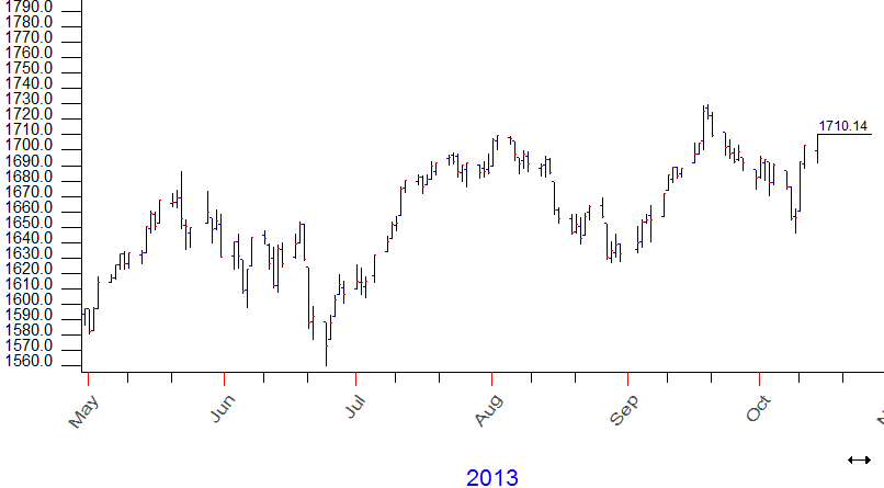
Run "Super canvas" module (follow menu "TI" -> "Super canvas"). You see below the typical price chart (as an example, it is S&P500 daily):
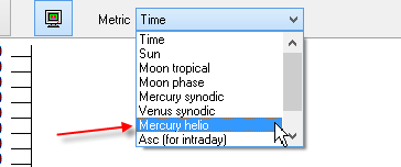
The stock market data is shown here using conventional watches - the same watches and the same time measurements that we use in our common life. What if we change the watches (= time metrics) used to display the price chart? We know that our conventional clocks are the application of the idea of the changes in the position of the Sun. So, we can imagine some watches where the watch hands are moving in accordance to Mercury heliocentric position. In the program it is very easy to do; set it here:
The price chart looks pretty much the same:
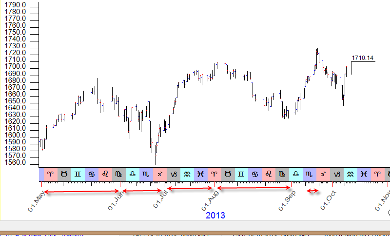
Or not? Look at the time scale; somehow the May month as almost twice longer than June month. This is because stock market uses another watches - Mercury heliocentric position. The time flow here is different than the time flow in the normal World. Look at this: Mercury heliocentic has passed almost 6 full signs of Zodiac in May 2013, while during the next month it has passed only 3 Zodiac signs:
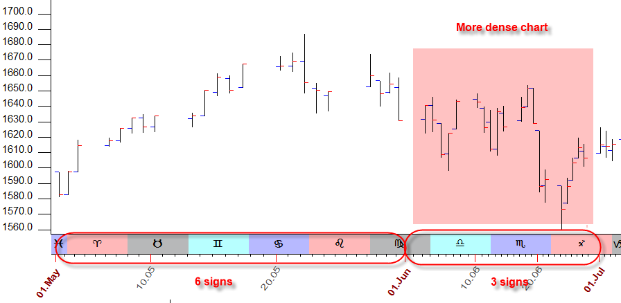
This is because Mercury movement is irregular. Accordingly the price chart in June is more dense than in May, Mercury moves more slowly in June, this period of time is emphasized.
So the usage of different time metrics gives us different price charts, and these price charts emphasize different periods of time. If we apply for these price charts our standard charting tools (like Gann Fans or Andrews Pitchfork), these charting tools will look a bit different than they look for the regular/normal price chart that uses the normal time.
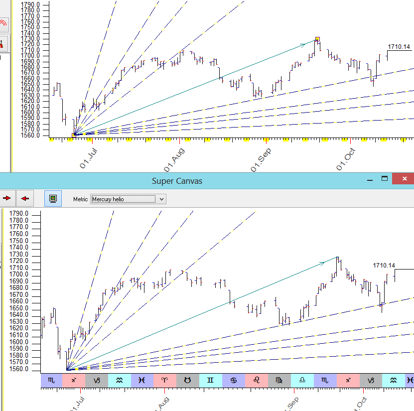
Look at the screenshot below. It shows the same Gann Fans charting tool calculated for different price charts. The upper chart uses the normal time while the bottom chart uses Mercury heliocentric time scale. These two Gann Fans are absolutely identical, i.e. they use the same anchors. But their angles hit different price bars:
In practice I recommend to apply the standard charting tools as we used to do in our standard charting. After that try to play with different metrics here:
When you choose a new metric, these charting tool will be automatically updated. Maybe the usage of these charts will reveal some new information that is impossible to see with a regular/normal chart.
I say "Maybe", because this technique is 100% experimental one, and we need to spend several years working together just to understand whether this approach works (in this case, this module will be developed more) or it does not work (in this case this module will be removed from the program).
October 15, 2013
Toronto, Canada