Chaos Theory and its application in Timing Solution
written by Sergey Tarassov
The main idea of Timing Solution is providing tested models and tools to get the reliable forecast for stocks, futures and indices. To achieve this idea, we go in two different directions. One of them is working on models. It includes the development of the models, back testing of their effectiveness and research on parameters that may be varied. It is a huge and extremely interesting job. As the result, you have new models and new ready solutions in the program as well as improved old ones. And, of course, you can read new information on the website regarding these models. There is another way, though. It is the quest for new methods that may help to achieve our goal. It includes study of different theories and points of view not yet applied in the program, testing and programming of the most prominent techniques. As the result, you may have new modules in the program and/or significant improvement of already existing ones.
Though there are usually so many players on every markets as well as so many different factors and forces involved, we still look at each and every market for any financial instrument as a separate entity. We can do it due to the concept of wholeness common to some ideas and sciences. This concept allows to work with phenomena that can be registered and documented (stock market price data, for example) and have no reasonable explanations yet as to regarding their nature and modus operandi. A good example is a human being. You get up in the morning and feel yourself extremely well. Everybody looks at you and gives you a smile. Why is such a reaction? Because they know that there are several billions of different cells in your body? Do they really care about functioning of your heart or stomach? You may look happy due to so many different reasons... And still, the world sees you as a unique entity. Same with the markets. No matter how many shares are traded today, no matter who are participants and what are their intentions - all these things somehow will show up in the appearance of this entity, this market.
As an entity, the market reveals itself to the world. And we can observe it, record our observations, interfere with it, provide some actions, enjoy or suffer the results of our actions towards this entity, remember our experience. All these things form our knowledge about this market's behavior. It means that we can try to predict its future, in accordance with our knowledge.
Modern mathematics gives us a lot of useful tools - theories - that can help us in this quest. One of such theories is Chaos theory. I would not go into details here, however those who are interested in its application to market research might find many interesting thoughts in books by Edgar E. Peters, "Chaos and order in the capital market" and "Fractal market analysis".
I have spent some time applying some ideas found in these books to Timing Solution. You may see it in the latest upgrade (December 10, 2005). This article explains how it works in the program. As so far, the use of Chaos theory ideas improves the forecasting abilities of the Timing Solution program.
R/S Analysis: finding the best training interval
One of the things that proved to be useful is Hurst exponent. This idea has an interesting history itself. Its author, Harold Edwin Hurst, had spent many years as the hydrologist on the great Nile river. He was an engineer and the designer of dams to regulate the water level in the Nile. His duty was recording and analyzing the rises and falls of the Nile River as well. Once, analyzing the water level data, he has found that the data do not follow the normal statistics. He assumed that he was dealing with some other kind of phenomena, much more interesting than random movement due to Brownian motion. The river's water level seems having a kind of "memory" regarding its previous levels. And the new indicator, Hurst exponent, was born. We can take it as the measure of some phenomenon's memory. (I apologize for humanizing such things as market data, water levels, data sets, etc. My only excuse is that we deal here with phenomena that are going on and on in time, and "humanitarian" parallels help us to understand the core idea.)
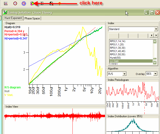
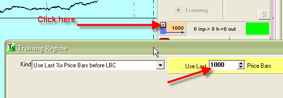
This technique is included into Timing Solution as preliminary results show that it helps to improve the projection line. You can see it in this window:
Of course, before doing anything, you have to download some price history data
to be researched. Then click on this button: ![]() . After
that you will see a diagram in the central part of the window, with several
curves of different color.
. After
that you will see a diagram in the central part of the window, with several
curves of different color.
This is the explanation of the diagram:
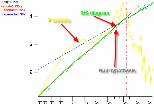
The gray dotted line represents the null hypothesis. It is the R/S diagram for a totally random process.
The lime line represents the R/S diagram for the analyzed price history. The difference between the lime line (R/S diagram) and the gray dotted line (Null hypothesis) exists, and it means that we are dealing here with the non random process. The most important parameter is the slop of R/S diagram, this slope is actually the Hurst exponent parameter.
There are three possibilities here:
1) R/S diagram is very close to Null hypothesis line. In this case, the slope is very close to 0.5. This is a random process.
2) R/S diagram has the slope higher than 0.5, the lime line is above the null hypothesis line - we deal here with persistent time series. The current market movement depends on previous movements.
3) R/S diagram has the slope lower than 0.5, the lime line is below the null hypothesis line - we deal with anti persistent time series. Very often this process is considered as a "mean reverting". The current market movement tries to compensate the previous movement.
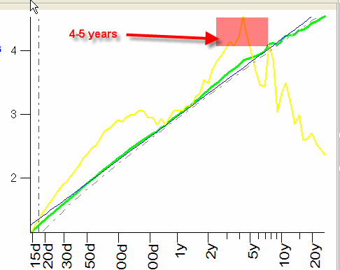
The most interesting for us is the yellow diagram, so called F Statistic. Its maximum on the diagram means the length of so called stochastic cycle. This is not a regular cycle we used to deal with. You can take it as a length of stock market memory. And I recommend to use this value as the length of the training interval for Neural Net.
For example, look at analysis of the DJ index from 1950 to 2005:
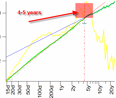
Here we have maximum around 4-5 years. In other words, we can say that the DJ "remembers" its history within 4-5 years. It is very close to Presidential cycle described in one of our earlier articles. By the way, this result has been confirmed by Back Testing (see the article about Presidential cycle and Back Testing for it in the Library section).
So, making the forecast for DJ index, you can set this parameter:
1) in Timing Solution Styles:
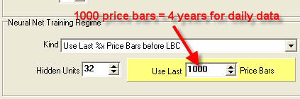
2) or right in the Neural Net window:
For S&P500, the R/S diagram looks like this:
We have almost the same picture as for DJ index, the stochastic period is 4-5 years.
For NASDAQ we have:
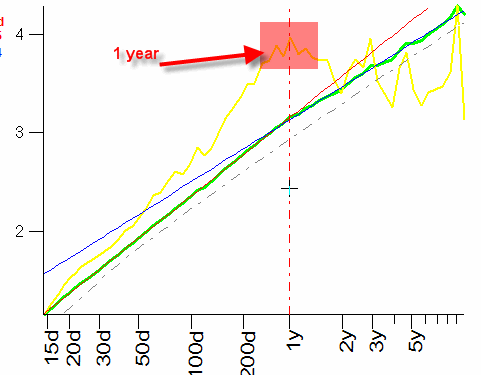
The stochastic period is 1 year, though it is not so strong.
For EURO/USD :
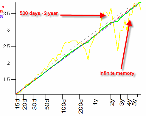
We can specify 500 days - 2 years period, and we face here the effect of infinite (or very long) memory, the yellow line continues to rise. In this case, it is hard to define the impact of any event on the market as we cannot say whether this event is random or it is something that has occurred already and is a part of stock market memory.
You can use any index to calculate the Hurst exponent. For example, this is the R/S diagram for Relative Price Oscillator:
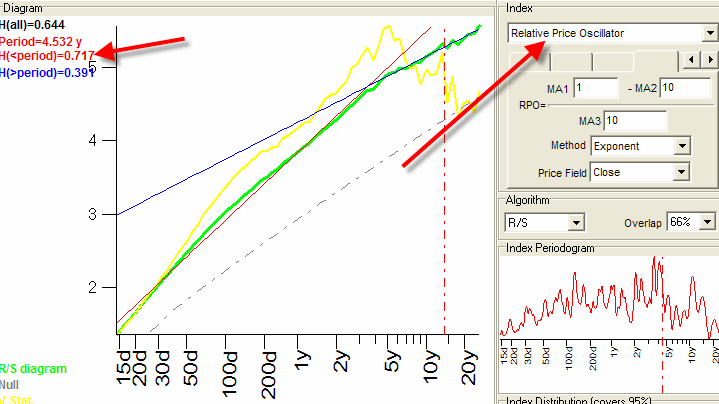
The Hurst exponent is higher here than 0.5; in other words, the Relative Price Oscillator is more persistent. There is an opinion that "experiments with backpropagation Neural Networks show that series with large Hurst exponent can be predicted more accurately than those with H value close to 0.50. Thus the Hurst exponent provides a measure for predictability."
Phase Space - stock market breath at a glance
I have got this module while reading books on Chaos theory. I have programmed some of the ideas, and here is a snapshot of what I have got:
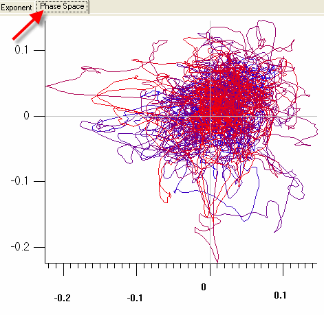
Here you can see a moment of the stock market movement, at a glance. Technically, X axis here corresponds to the value of the Relative Price Oscillator for all available price data, while the Y axis corresponds to the Relative Price Oscillator 100 price bars ago:
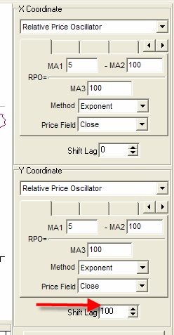
Try to vary the Shift Lag, and you will see very impressive picture of stock market breathing.
The most interesting picture we got using different indicators:
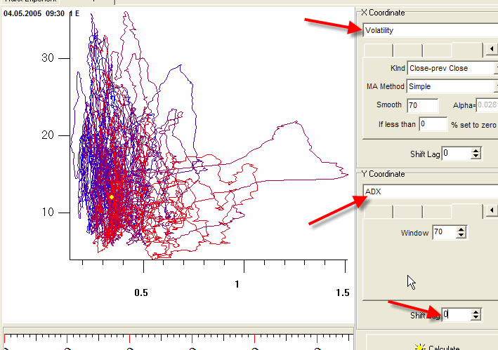
Here X axis represents the current Volatility, while the Y axis corresponds to the current (no Shift Lag!) ADX index (we have analyzed DJ index from 1950 to 2005). Look at the diagram. The blue curve corresponds to the data that are closer to the year 1950. The color of this curve is changing gradually, and it becomes red closer to the year 2005. We can specify two clusters here. The blue cluster is wide and high, while the red one (that is closer to our days) is wider and not so high. The wider red part of the picture means that the stock market has a higher volatility now than in 1950es (X axis corresponds to Volatility). The Y axis corresponds to ADX index, and we can say that this index is less now (in average) than it has been in 1950es. If take the market as a big knot, you may try to untie it in this window.
Try to change the ![]() and you will see how this diagram will rotate.
and you will see how this diagram will rotate.
It is interesting to watch different loops in this diagram. Looks like the loop outside the major mass represents some extraordinary event of the market's life. Do you see the black loop to the right? It is the October 1987 drop. Is not it fascinating?
December 10, 2005
Sergey Tarassov
Toronto, Canada