Inflation Case Study
Astronomy works for economy
This article is written to illustrate the analysis of Consumer Price Index (CPI) for Great Britain. The data used cover a period from 1666 till now. In some book, I have seen a diagram for that same index, starting from the year 1450. Unfortunately, I do not have these data and would be happy to get it. I would like to mention also that this research is NOT an illustration of some econometric theory. I simply look at these data from the point of view of mathematics and astronomy. All calculations and diagrams are made with Timing Solution software.
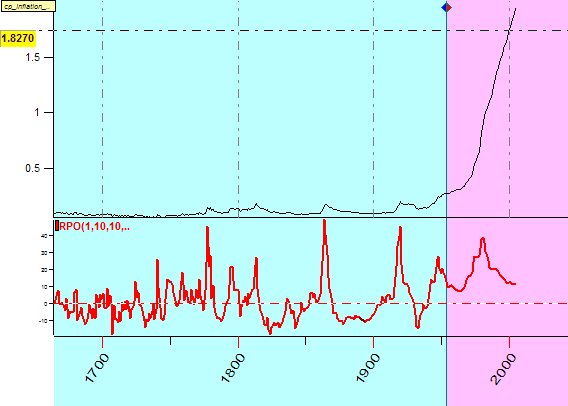
Let us start. This is the diagram that represent CPI, as per our data file. The upper part (the black line) reflects a sad observation that prices always go up, the lower part shows the oscillation of the CPI. We will work with the red curve (normalized data):
The first thing we can do is to find whether there are any regular cycles involved. It means that we need to make a periodogram for this index.
It is here:
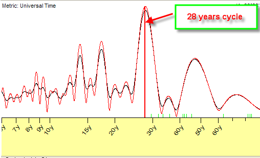
It shows that the most important cycle is 28-year cycle.
Using Timing Solution, I have created several models - based on this 28-year cycle and on other cycles from the periodogram as well. The results were poor.
The scientific community may condemn me for that, but I think that the application of astronomy based cycles is more relevant technology for the tasks like that. So, instead of using regular (based on numbers) cycles, we can take the periodogram above only as some clue to astronomy based cycles. Thus, 28-year cycle is very close to well-known to astronomers and other astro public Saturn cycle. We can make a composite diagram for this Saturn cycle and our data. Here it is:
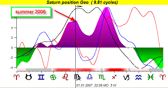
It shows the CPI changes in regards to Saturn position in the sky. You see there three colored lines. These are Saturnian cycles calculated for three independent data intervals. Sometimes all three lines show the same tendency. At these times, we have a strong confidence as to relevantness of this cycle. These are red zones at the bottom (I call them active zones, and I would take into account the info only from these zones).
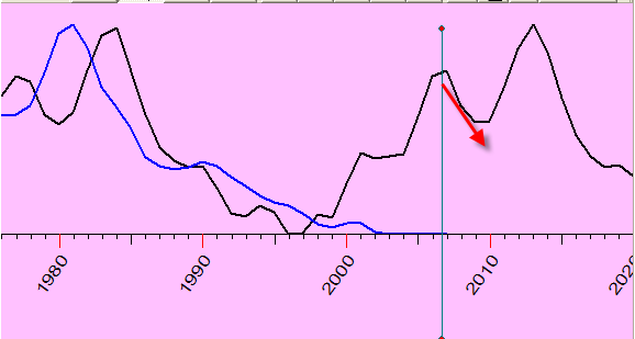
The following is the diagram that shows the CPI changes from the Saturn's point of view (a black line; the blue line is CPI oscillator).
There is one more interesting fact that has really surprised me. It is a connection between the CPI changes and the position of Gravity Center of Solar system. (The influence of this factor on our lives was explored by Dr. Theodor Landscheidt.)
Look at this picture:
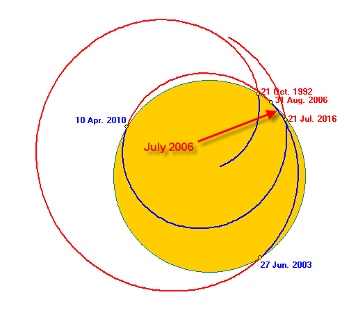
This is a trajectory of Gravity Center relative to the Sun (shown as the yellow disk). The dates shown are related to the moments when this trajectory crosses the Sun's photosphere. The most recent events are: the Gravity Center has entered the Sun's photosphere on June 27, 2003 and it will leave it on August 31, 2006.
I did a diagram for Gravity Center (a teal line) and CPI oscillator (a red line) together:
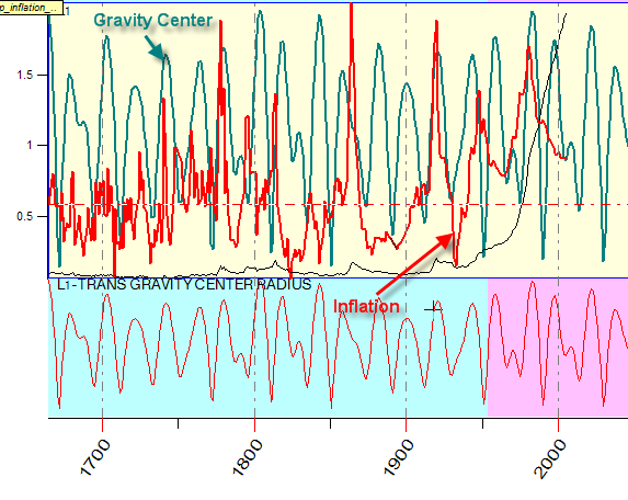
Although there is no ideal fit between these two lines, we still have a correlation, and it is 13%. Are these 13% helpful? Yes, they are - when we have no other alternatives. At least, it gives us some information, instead of scary stories that might (or might not) occur.
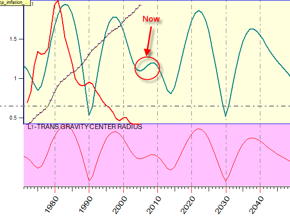
I did a model for CPI future projection based on Gravity Center factor. Here it is:
I would like to remind you that all the above is not an econometric model or theory. Economy is a complicated puzzle with a lot of factors intertwined. We need to conduct a thorough study of all factors that might have some effect on markets before suggesting any theory.
Sergey Tarassov
July 20, 2006
Toronto, Canada