����������������������������������� One persons way of
Trading a Market
����������� Start off looking at a Market with a
yearly chart, and let�s walk through a chart and find some information that is
there, how every a lot of traders that I talk to never think about looking or
for that fact never has thought about a yearly chart !
�Now stop and think if you are going to trade
say, off of a Daily Chart, you start with looking at a monthly and a weekly
Chart, then you move into the Daily Chart. Why do you look at a larger time
frame then what you intend to trade?
By
looking at a Yearly Chart, you will be able to see the BIG over all picture of
where this market has been, where it is going. Looking at a chart anytime frame
be it weekly daily or intraday always ask yourself, where did this price level
come from and where should I be looking for where it is going, based off of the
history of this market.
You
will also want to note where and when the Highest High and Lowest Low was. How
long did it take to get there? Look for the time of the year it made these
Highs and Lows. Then you want to move inside these larger moves to a smaller
time frame. All of this information needs to be recorded and keep as a diary of
the market and its actions.
In other
wards look for the time duration from the Highest High to the Lowest Low. Then
Look for the time duration from high to the next high and high to the Low, then
get the time from low to low. You want to learn, this market and the only way
to understand it is by doing your homework by gathering as much information about
the market and its movements.
These
are a real living, breathing money eating, market and in order for you too
really understand it is gathering all the information before you start placing
trades. I know a lot of traders that just look at a market, be it daily or intraday
and then they just jump in and start trading. Most of these guys blow their
accounts in the next few weeks or months. Then blame the software or the market
didn�t do this or that as it should have. And the list of why they lost is endless.
When in truth it was not the
software, or a friend that gave you an inside tip. It was really you. You were not prepared.
I know
I have been there and done it. I was always able to come up with a reason as to
why it happened. Then my wife said, you did it, that so called software that
you spent x amount of money on was just a tool.
To be a successful trader, homework
studying the history of a market is more time consuming and a great deal of
work. Once this part is completed, you will find that your knowledge and
understanding of this live living breathing beast, we call a Market, will
reward you very well.
�� I
learned many years ago why pockets was sawed into my pants. At least until I
got married. But that is for another book.
�By
the way I want to point out that the Charts you will be looking at was built in
Timing Solution Software. There web site is at; http://www.timingsolution.com/
and �Excel 2007.
Let�s take a look at this Yearly beast and
see what we fine. This Market is AUDUSD which stands for Australia Dollar and
the US Dollar, it is a Forex market. This study you can use with any market be
it S&P 500 or the Dow, Corn, Cotton any market. A market is a market. All
of them have three items in common. First it takes traders, Buyers and or
Sellers. There must be someone on the other side of the trade. This also
creates Volume. Secondly you will have a PRICE bar that is made up of four
parts. Open High Low and Close. This bar can be a Line on Close, Japanese Candle
Stick or Western Type Bar. The last is no more than a vertical line with the
Open on the left and the Close on the right, the top is the High and the Bottom
is the Low. And there are many others.�������������������������������������������� �These Charts are Candle sticks and Line on
Close.�������������� Below is the Yearly
Chart.
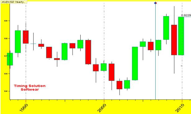
�This is what the AUDUSD looks like on a yearly base. Each Candle
Stick represents one year of Data. It was built from Daily Data. The Data here,
tells you a lot of where this Market has been and where it is now,( November
27, 2009) You can see that the high in 1990 was the Highest High, then the
market turned down and made the Lowest Low in 2002. In 2003 the (tail) lowest
point of the Candle was just below the Close of 2002. The High of 2003 was just
above the high of 2002. Would you call this a sign for a change in trend? �
The next Candle 2004 rocked straight up. A
lot of buyers in here. Gold must have been doing good that year. However in
2005, the bulls and bears was at a battle and the bulls did win, but not by
much. The top of 2005 run into some resistance from the Close of1997 and the
Opening of 1998. The next two years 2006 and 2007 stayed inside the range of
2005 Candle. �If you draw a line across
you will see how this resistance level worked. And then in 2008 was a good year,
large up move, strong broke through the resistance level. Now in 2008 this set
an all time Highest High until 2009.
�Just from what we have talked about, the old high was taken out by
a new higher high and the low is still in place. Now we have a new distance of
travel from Low to High not only in Price but also in TIME. This RED Candle Stick (2008) as you can see largest
Candle in this Chart. Going into 2008 started off good, but then somewhere
during the year the traders started looking down and the market made the
largest Candle from the past 22 years !��
Now the line that runs up through the last bar on this Chart is 2009,
although it is setting on the line of 2010. The width of these bars over laps
each yearly mark at the bottom of the chart.
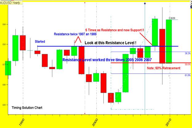
Now let us dig into this Yearly Bar Chart a
little deeper. Do you see any Patterns? Is there any other signs you see? The
last bar 2009 is still working as an inside bar from 2008. This is a sign, that
the market is not sure which way it should go. Now I�m not going to get into
the details of watching the Forex news. And Reports that comes out from all of
the governments of each country, GNP, Housing, Consumer reports, Oil Reports,
Gold Index and the like. I will leave that to you, your homework.
�Let�s take one more look at this Chart and see if you can see what
I see. By the way remember, if you cannot see a formation, then other trades may
not seeing one or for the most part there may not be one there to see.
�Your next step is to build your data from the
Market data. We are going to pull this information from this data and see what
we can come up with.
�Next I look at the Yearly bars and place them
into a graph form that is understandable.
|
|
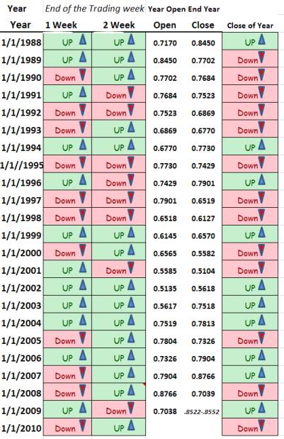
This little
chart on the left you will fine is a great tool to have. As you can see the
left Colum is Dates of the Years. �Now remember at the start I said, to look
at the big picture? �This little chart will help you see where
the Market is as well as where it may be going. You will also be able to see
what the last few years has done. �Look at the next two Colum�s label �1 week�
and �2 week�. �This is the first two weeks of January of
the year. Watch the Open and the Close of that week. Now I know what you are
thinking, Randy this cannot work that easy! �Well let�s look back in history. Look at
1999. First two weeks was up and the end of the year was up also. Ok, let�s
look at 1988. Once again the first two weeks was up and the end of the year was
down. Look at 2002, what happen here? One more let�s take the year 2004. What
happen here? �Just from looking at this Chart what do you
think will happen in 2010 ? �I will give you one hint, before you start
dropping me emails. �What is the name of the software you are
working with? |
�Our next step is to dig a little deep. Now
you are going to get into the data of this market. We are going to look for
Time as in Tops and Bottoms, Time from a Top to Bottom and Time from Tops to
Tops and the same with Bottoms. We are going to use this information in Timing
Solutions to build our forecast.
�If you have Excel, and know your way around
it will be a great help in the following work.
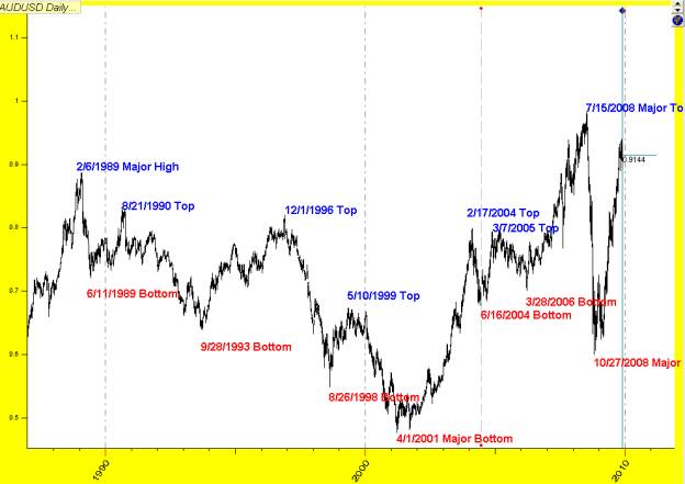
Now we
are going to look at the Daily chart. And pick out the Tops and Bottoms.
�Once we gather this information, we are going
to put it into Excel. This is just one step towards our forecast.
In
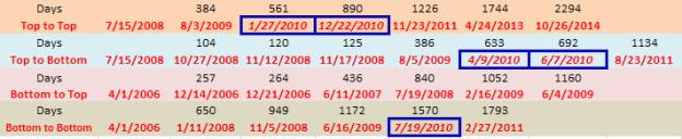
Excel this is how we set up our sheet and put in the data.
�Once you have all of your data counted for as
in the above sheet.
�Your next step will be to work your data and
pull the information out into a workable and understanding way that you can
use. This we will work with in T.S.� Keep
this in mind.
���������������� 
�From the data above our next step is look for
highs and lows by date. This you may not see at first how helpful this part is,
but as you work with this and go back over your charts and look at the past you
will start seeing patterns, and these patterns is what you do want to know.
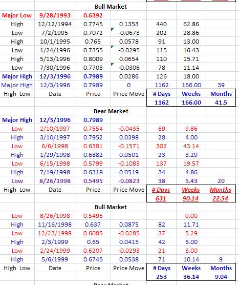
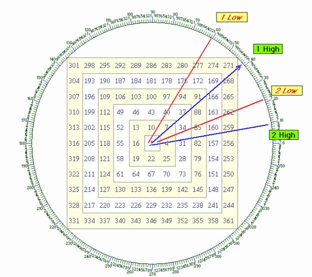
Now for
the guys that knows about working with the Square of Nine. You will fine this
Interresting as where these Bear and Bull Market Numbers, (using # Days) falls.
�
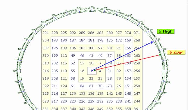
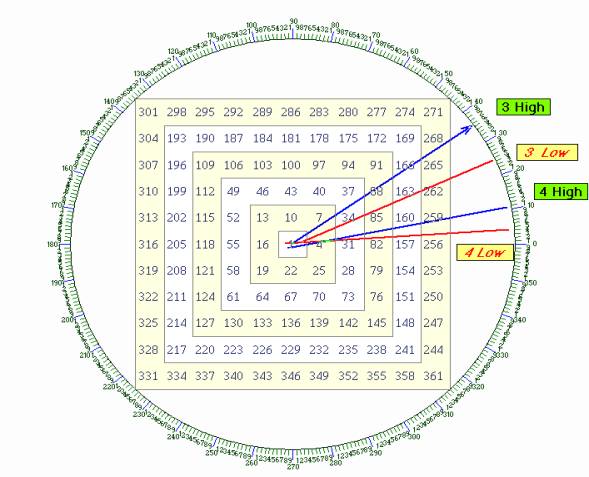
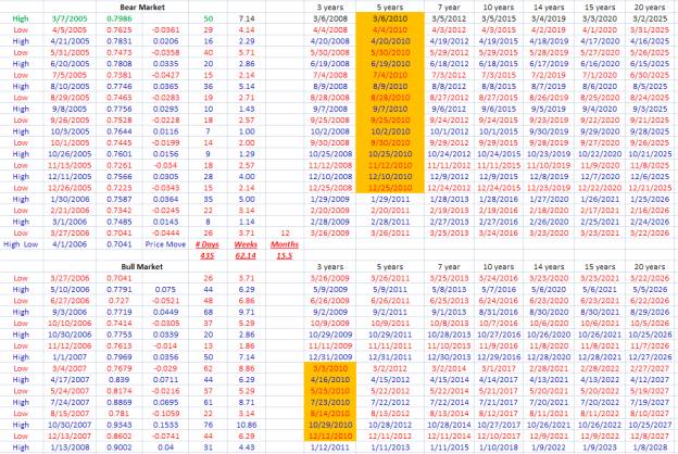
When
you get all of your Data Bull and Bear Market in your sheet. Add 3,5,7,10 years
to the date on the left. Then pick out the year you are working with. Here I
have all of 2010 highlighted. Then you are able to place in it on a form that
is next.
This
information will give you a quick look for next year.
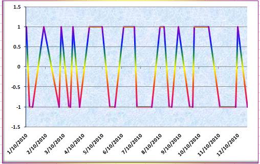
�By taking your High and give them the weight
of 1 and the Lows -1. You will get this chart.
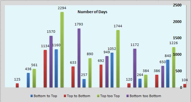
Next
chart shows the Number of Days. This is very important to know.
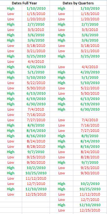
Take
your home work, and now plot it on the chart. This will give you some insight
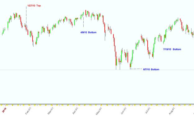
what to look for. As you can see the first date 1/27/10 did not make a TOP, but
you would have been watching for a turn in trend.
�4/9/10, Was not a bottom, but you would have
been ready for a change in trend. After the weekend the market did turn for the
down side. Look at 6/7/10 Bottom bingo this made a Bottom and then the Market
went up from there.
7/19/10,
Put in a Bottom and you would have been ready for a trend change. The market
did go up from there.
����������� �Now we are going to get deeper into Timing Solution Advance. We
are going to be working with Spectrum building some interesting cycles.
Remember
back on page 7 at the Bottom I said, remember this.
All of
your ground work is going to pay off now. I�m going to show you away to work
with Spectrum and build cycles just for this one market. And we are going to
compare this forecast with two other forecasts that was also built in TSA.
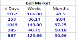
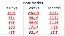
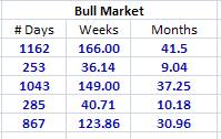
 In
the above chart it is showing; # days, Weeks and Months. We
are going to work with #Days. So
let�s go into Spectrum and start building our next step.
In
the above chart it is showing; # days, Weeks and Months. We
are going to work with #Days. So
let�s go into Spectrum and start building our next step.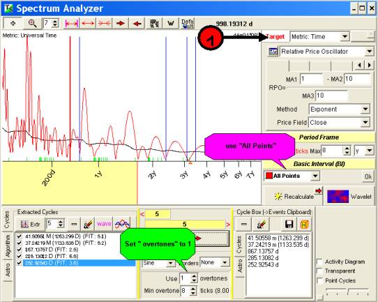
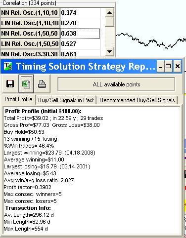
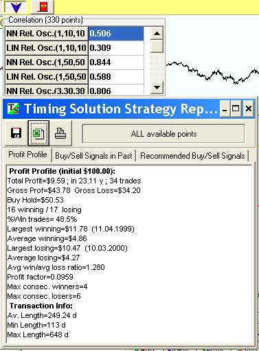
�Be sure you set this up correctly. Use 1
overtones and � All Points�. After that click on Recalculate� Once it is done
calculating. Pick out the Cycles you have for Bull Market. This market we are
looking for 1162 Days 253,1043,285 and 867. Once you have these �send it over to the Box on the right. This
will put it into Clip Board. Now you can bring these into Neural Net. Open up
Neural Net then click on from clipboard. Run�
NN 20,000 and stop it.
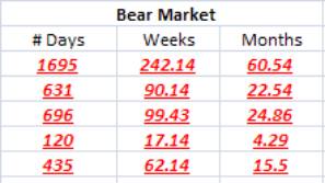
Do the
same with the bear market. Run it 20,000 times and then stop. Save each one as
a file.
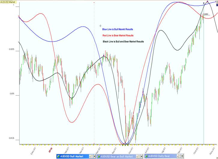
�Let�s look at some results. This is the Bull
Market.
This is
the Bear Market;
�
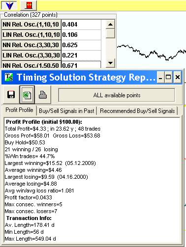
Ok now let�s
put both of them together and see what the results will be.
�I hope that some of you, found some good
information in here. Keep in mind that this is just one persons way, of working
with the Markets. I have found� that
Timing Solutions Advance is like the markets. It is in constancy changing, and
every increasing our knowledge in this amazing field.
�I welcome all inputs, be it good or bad. Your
opinion counts and is a great learning tool.
�Thank You for taking your time and reading my
input. I�m excepting some write ups from our fellow group members so we all can
learn.
Happy
Trading to you.
�Captain Randy Cole
This is Not trading or investment advice. This is strictly for
educational purposes only. 10/25/10