How to use correlation coefficient
What is the Correlation Coefficient?
This is the definition from Financial Forecast Center (http://www.neatideas.com/cc.htm).
What is the Correlation
Coefficient?
The correlation coefficient
concept from statistics is a measure of how well trends in the
predicted values follow trends in the actual values in the past. It is a
measure of how well the predicted values from a forecast model "fit"
with the real-life data.
The correlation coefficient
is a number between 0 and 1. If there is no relationship between the
predicted values and the actual values the correlation coefficient is 0 or very
low (the predicted values are no better than random numbers). As the
strength of the relationship between the predicted values and actual values
increases so does the correlation coefficient. A perfect fit gives a
coefficient of 1.0. Thus the higher the correlation coefficient the
better.
The correlation coefficient varies in the range of -1 (-100%)..+1(+100%). Timing Solution software measures the correlation coefficient in %%. It means that instead of r=0.123 we use r=12.3%
Practice shows that for financial analysis it is better to use percentage. For example, suppose we have found the projection line that provides correlation 5%. Following the usual notation, it should be marked as r=0.05.
It can be easily misread as r=0.005, especially when you analyze many correlations (like in Walk Forward Analysis reports).
If you use percentage notation, it is r=5% versus r=0.5%, you never mix them up. It is a convenient way as 5% level is very important (see below the explanation).
What correlation is good enough? The more the better. Usually, the models that we analyze provide 10%-20% correlation. Sometimes it is more than that, but these results are not stable. To be sure that the result is not accidental, it is necessary to have a sufficient amount of price bars for calculating the correlation. For practical usage, you can use this table:
| Correlation | Meaning |
| 100% | means ideal coincidence between some data and the projection line |
| 5% | weak correlation, this projection line is not usable though it reflects some stock market movements |
| 10% | we can take it as a not bad correlation |
| 15% | good correlation |
| 0% | no correlation. Two sets of data are not related |
| -100% | this is anti-correlation, which means that the predicted values "mirror" the actual values (or one data set is the "mirror" for another one). |
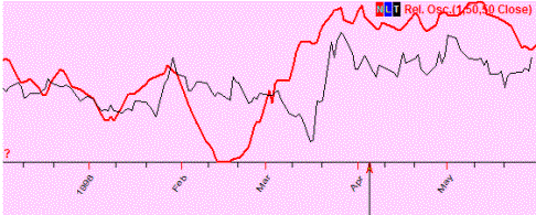
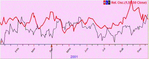
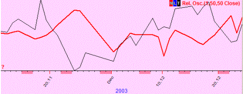
These are examples:
Positive correlation (50%); these two curved lines show the same price movement (most of the time). In other words, a predicted price and the actual one show the same price movement (up or down):
No correlation (7%); these two curved lines show totally different movements (if one goes up, the other may go up or down and there is no regularity seen there):
Negative correlation (-4%); we observe the "mirror" effect (when one curved line goes up, the other one goes down in most cases, and vice versa):
Incorrect usage of statistical criteria is the most common problem in finance. Here I will show some examples of incorrect usage of correlation criteria:
Example #1: in 2007 year it was a good correlation between classical Bradley siderograph and the stock market, here they are: Bradley (red curve) and SNP500 chart:
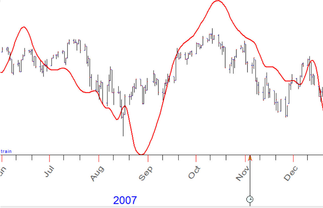
Correlation between these charts is about 80%. The question is: does Bradley ideograph forecast SNP500 with accuracy 80%?
Example #2: there is a big correlation between the stock marked in 1918-1928 (red curve) and current chart 2007-2016:
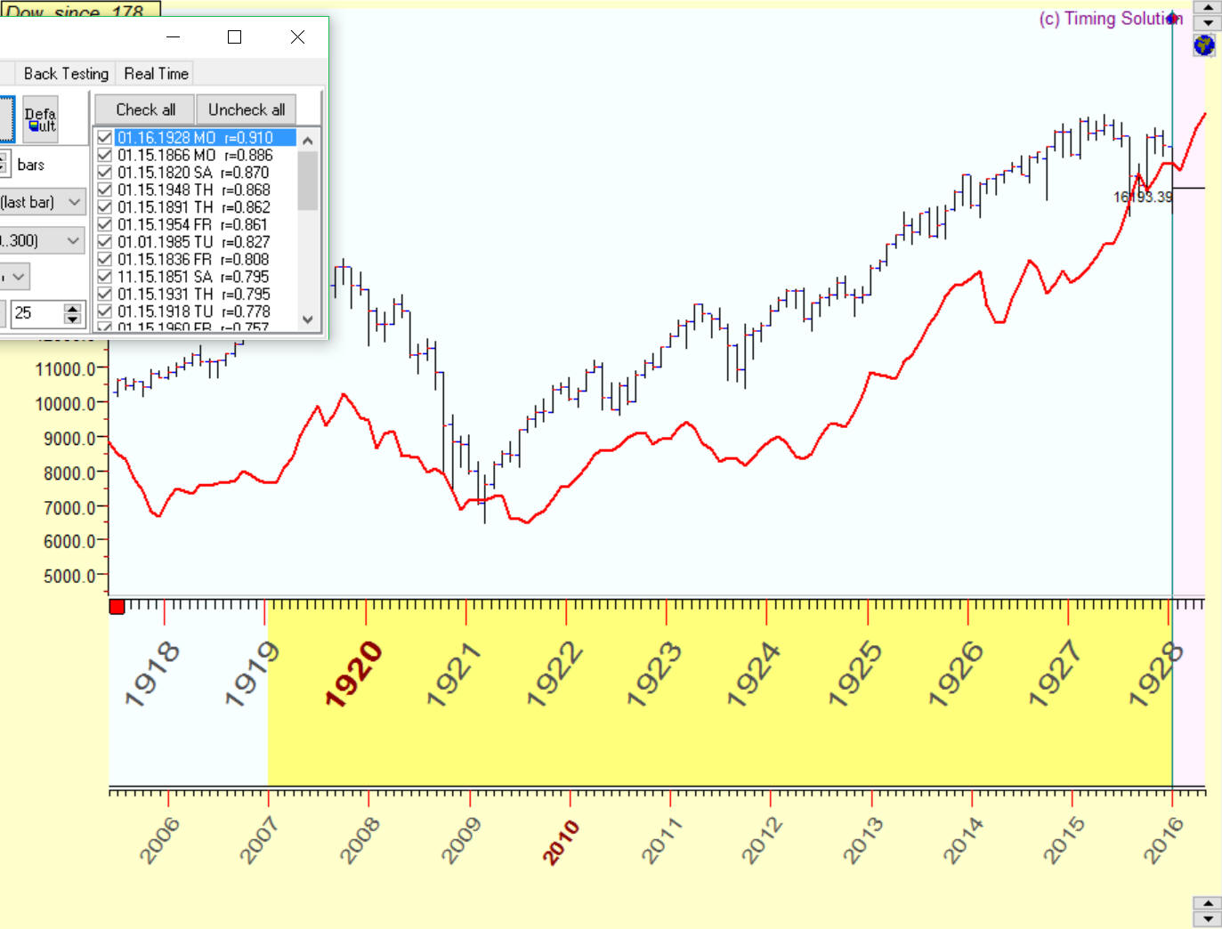
Correlation between these charts is about 91%.. Does it mean that with accuracy 91% we move to 1929 year?
Example #3: correlation between this blue projection line and the price is 65%:
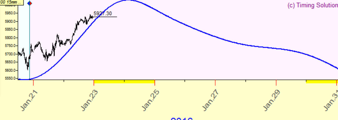
Does it mean that with accuracy 65% this projection line forecasts the future?
The answers to all these questions is NO. And now I will explain why.
Suppose we decide to go for a shopping in Oakville's Whole Foods Market. It is located 15 miles away from my office in Mississauga. I take my car, and our trip begins.
At the same time, another car (black Honda) has left the garage and started to go somewhere. It is moving in the same direction, and it is already four lights ahead of us.
The question is: does it mean that with accuracy 100% this back Honda moves to Oakville Whole Foods Market?
The answer is obvious - NO. Common sense tells us "not of course, because we do not know a) Are these guys used to go to Oakville Whole Foods Market ? b) Will this black Honda make next turn in the correct direction? ".
Now let's consider closer this common sense's approach:
Knowledge A: Are these guys used to go to Oakville Whole Foods Market?
In practice it means that technology we discuss should be backtested. Knowledge "once a week these guys in the black Honda attend Oakville Whole Foods Market" is the same as our projection line: it is statistically verified and tends to point at the right direction.
Knowledge B: What will be the turn that this black Honda makes?
Common sense tells us that we need to have enough confirmation that this Honda goes to Oakville Whole Foods Market. Each turn in the correct direction gives us more confidence. Speaking about the projection line, it means that this projection line should forecast several turning points or if it is possible to specify some cyclical movement - this projection line should forecast at least two full cycles.
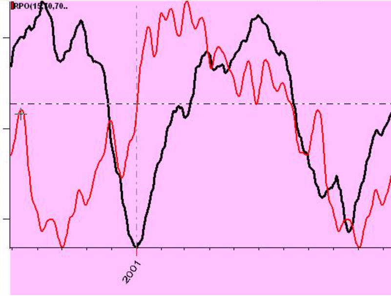
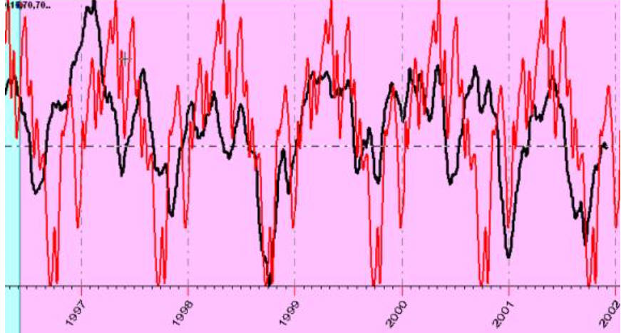
Look at these charts:
this red projection line forecasts two full cycles:
while this projection line forecasts five full cycles:
In this example correlation 10-15% on five full cycles statistically is much more significant than 80% correlation with first example in this article with Bradley siderograph. It means that the black Honda is already making correct turns and we are practically sure about final destination.
Let's look at the projection line like this
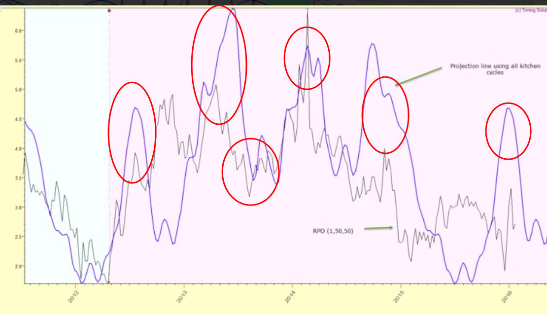
Visually it looks impressive: it forecasts five local turning points, and the correlation will be high here (70-80%). However, I would not recommend to trust these digits too much as this projection line forecasts 4 years cycle while analyzed interval covers only one full cycle.
IMHO in this situation visual analysis is better solution here than formal statistical criteria. Your eyes are a very sensitive instrument, it can recognize patterns that sometimes practically impossible to recognize using formal methods. You can simply rate coincidence using a scale like this:
AAA - excellent coinsidence
AA - good
A- not bad etc.
All my life I have dealt with digits and I tell you: "Never trust too much to digits with high % etc. unless you fully understand how these digits were calculated. Common sense always should be with you".
Another problem with correlation coefficient is caused by irregularity of financial data. Correlation works good when we work with normally distributed data, and this is not about finance.
Look at another analogy that sends us to 1838 year:
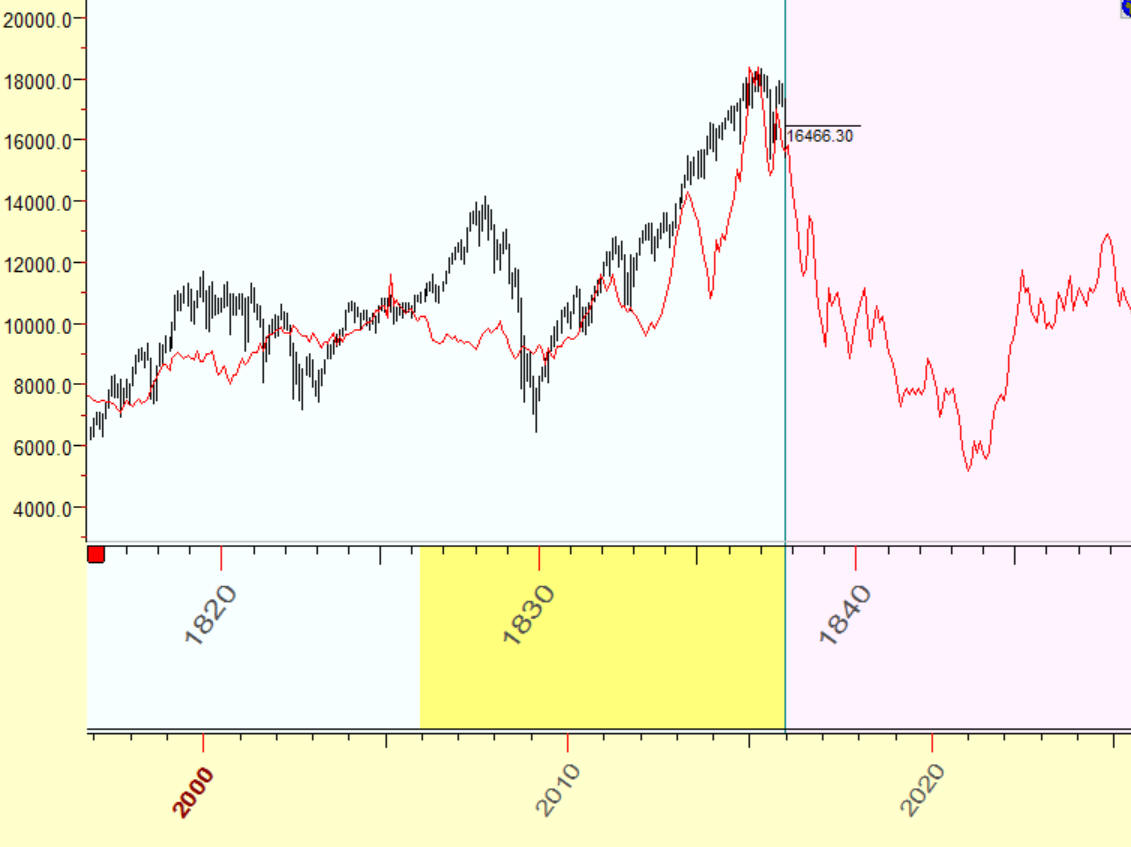
These charts correlate with accuracy 84%. Does it mean that with accuracy of 84% we are entering into 1838 year? No, of course. At this point I highly recommend to be very cautious here: the big correlation (84%) and a real similarity between these charts usually impress the public but has no big statistical significance. In this case I recommend going deeper into details to better understand what was going on there. Let's do it together.
Firstly the high correlation de facto represents the analogy between two big movements within 7 years interval: 120% growth of 1830-1837 and 180% growth of 2009-2015:
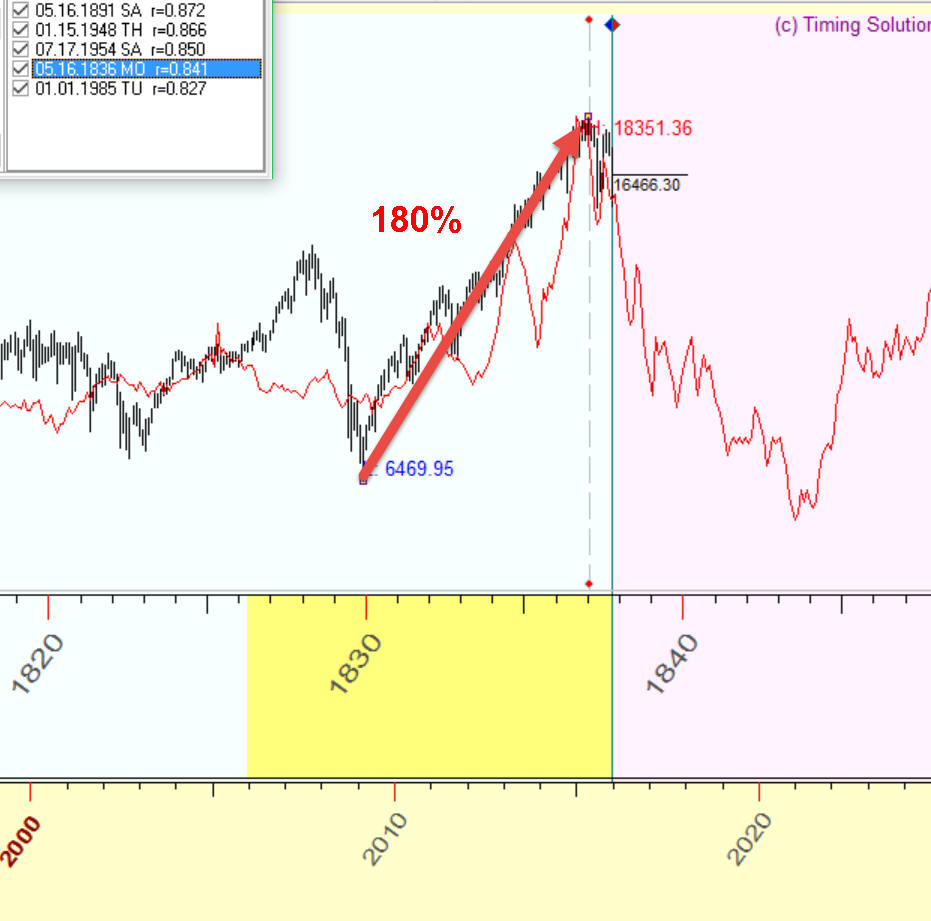
You can check that this movement is big enough but still not extreme: between 1994-1999 it was 220% growth, 1982-1987 it was 270%, before Great Depression 1922-1929 400% !!! growth.
Maybe some economical theories are more interesting here than searching for analogies. I personally track Shiller S/P index to figure out where we are now.
This is screenshot from Robert J. Shiller Nobel Prize lecture "Speculative Asset Prices":
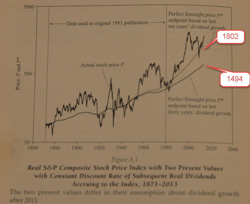
You see two smoothed curves there together with S&P500 price chart (logarithm scale). These two curves represent dividend model, i.e. they calculate subsequent average dividend for each year. This value is deflated to US Consumer Price Index. Obviously the stock market (S&P500) should oscillate around this index; also when the stock market is significantly higher than this index, we have overpriced stock market.
This article has been written by R. Shiller in 2013, the adjusted value for S&P500 at that moment was in the range from 1494 to 1802. This is the price that reflects S&P500 value for real dividends for this year. Now (January 29, 2016) S&P500 is 1940 so we are not far from upper level of the "equilibrium" price. To track this index, you can use Shiller P/E ratio, here it is (from website http://www.gurufocus.com/shiller-PE.php):
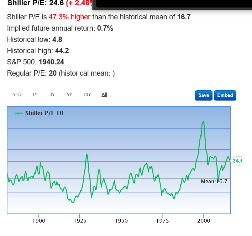
The unknown question here is: should we use 10 year dividend growth or 30 years as a guide for the future? Accordingly we have two possible averaged values for Shiller P/E, you see: red horizontal line 24.1 based on the last 10 years and blue 16.7 level based on the last 30 years. In the first case (last 10 years) S&P500 is around equilibrium point now, while in the second case (last 30 years) S&P500 is still overpriced for about 40%. BTW, similar way works Warren Buffet index that shows market cap divided by US GDP.