Stock market waves in the light of the Moon
written by Sergey Tarassov
(revised due to the software upgrade Feb.12, 2006)
Everybody agrees that the stock market follows some waves, but not everybody believes that it is possible to predict these waves. The stock market rises up to the sky and drops down to earth; since the beginning of the stock market, everybody wants to be able to anticipate these waves - otherwise the price for mistakes is too high. In this small article, I would like to introduce some new techniques and our team findings in regards to stock market waves. All results are based on solid grounds of statistical analysis and are performed by Timing Solution software.
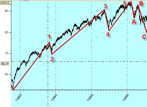
The most known theory on stock market waves is Elliot Wave Theory suggested in 1939. I think everybody is familiar with the classical pattern that consists of five upside waves and three downside waves. Like this:
The most important question is the height of the swings of these waves, because these swings' turning points are the moments when the trader makes his/her decisions (it is an ideal situation). Another statement of Elliot Wave Theory is that stock prices follow to Fibonacci series (1-2-3-5-8 ..). This simple and clear principle provides some clues regarding stock market timing.
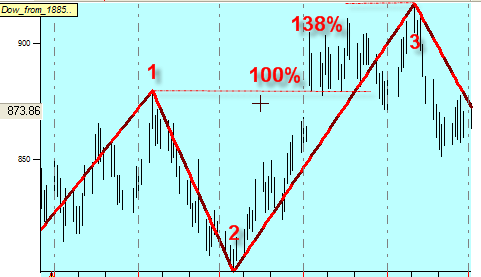
Usually the Fibonacci ratios apply to wave heights (like a ratio between up and down swings). Look at this picture
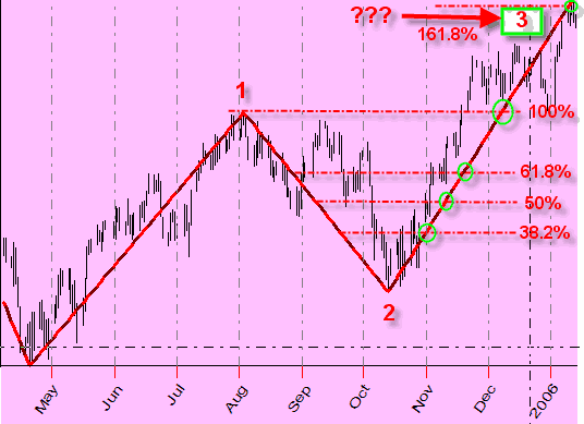
Here we are interested in defining the height of the upswing 2-3. We assume that the height of this swing is in good ratio to the previous downswing 1-2. In other words, we may draw several resistance lines based on half weight of the previous wave, its 100%, 38.2%,61.8%, etc. We can make it 161.8% as well. If the data pass one of the lines, it might stop at the other. There are a lot of possible varieties there. However, the main assumption is that the end of the swing hits one of these levels. Thus, we can say that these levels provide us some clues regarding trend change points. The same approach can be applied to time forecast based on the wave's length.
And this approach is very intriguing. It has occupied the human mind for centuries as it proclaims the existence of some universal law of Mother Nature that rules the rabbits' reproduction, the shape of the seashells and the stock market geometry as well! In terms of the twentieth century science, we can say that stock market waves have the quantum nature and we may consider the turning points as some kind of energetic levels using the analogy with quantum mechanics principles.
But the commonly asked question still exists: "How and when can we apply these ratios? What ratios are more preferable and when? How can we rely on them?". In this article you will find some answers to these questions and some unexpected results as well. Let's go ...
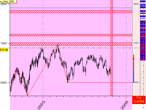
As an example, we will look through the data for Dow Jones Industrial Index from the year 1885 up to February, 2006. As a tool, we apply the newly developed module in Timing Solution software; its name is "Turning Points Analyzer". Actually, the answer to the question above will be received immediately after downloading the price history and running this module. In a few seconds, you will get this histogram:
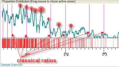
This histogram represents the distribution for the ratios between heights of up swing and down swing. We calculated the 4.6% zigzag exactly as A. Merrill did that (see Filter Waves Basic Theory, A. Merrill, NY, 1977). This zigzag has shown 900 turning points within the data interval; we used them to calculate ratios between swings. The purple stripes represent the classical ratios most used in technical analyses. The meaning of this histogram is: the highest and the narrowest peaks here correspond to the ratios this market (i.e., DJI in our example) "likes" more. As you see, one of them is 1.38:
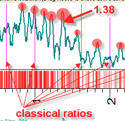
It means that 138% up trend swing is pretty typical for the stock market:
If you do not like working with the histogram, just pay some attention to red stripes located under it:
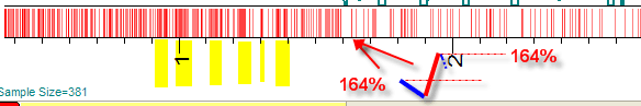
Each pair of down and up swings is shown on this diagram by one vertical red stripe. For example, there is one stripe at the 1.64 position. It means that there is only one down-up swing pair with the ratio between up and down trend swing equal to 164%. When we have several pairs at the same level, we can speak of a zone of trend change. Thus, we are able to locate active zones where the stock market "likes" to reverse its trend (some of these active zones are marked by yellow bars). Meanwhile, there are relatively quiet, calm zones where the stock market prefers following the current trend. This idea is worth to play with.
Actually, when I started developing this module I expected to get one of the two
possible variants of the histogram:
1) the boring kind of a bell histogram, something like this:
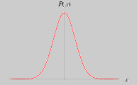
Practically, it would mean that there are no selected ratios. The trend can
change at any price level, and Fibonacci levels simply do not work;
2) if the classical ratios work we should get the set of peaks around purple vertical lines. It would mean that the stock market prefers the "good looking" price levels to change its trend.
The histogram above not did confirm any of these statements.
When I saw it first
time, I decided that there was some mistake somewhere in the
program, and I spent some time checking all parts of it to be sure that the program works OK.
As usually, the Mother Nature does not provide us with the completed answers
to all our questions. We just move from one enigma to another. Solving one
problem, we come across another, and always it is so unexpected! It is how we
grow up in our knowledge and understanding.
The strict statistical analysis shows that the stock market does follow some ratios,
and the most interesting fact in respect to stock market waves is that the Moon has
very strong impact on them. To be exactly, these waves are different for rising
Moon and descending Moon. And it
is quite naturally, because people's emotions have a great impact on the stock market
while, from the other side, the Moon phases have impact on human emotions.
It is easy to prove the first statement that price waves "like" some ratios more than other ones. The histogram calculated for different zigzags always contains different peaks; it means that the stock market does not move in a chaotic manner, some market geometry presents here.
To make reliable verification of this fact I have calculated the ratio histogram for 21 different zigzags with different time periods:
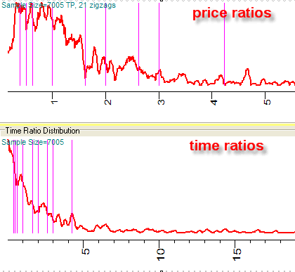
Here the same histogram for up moving swings is shown in
different ratios: ratios for price
and ratios for time. You can see what ratios are more important; the worth of classical ratios is obvious
here as well. Make your conclusions yourselves.
But the most interesting thing has happened when I have started to research zigzag ratios
together with Moon phases. Skipping all details and concentrating on final results
only, I can say that the histogram becomes more informative if we consider
separately the waves in respect to the rising and descending Moon. In other words, the market
geometry strongly depends on Moon phases. The picture below represents these
histograms calculated for rising Moon:
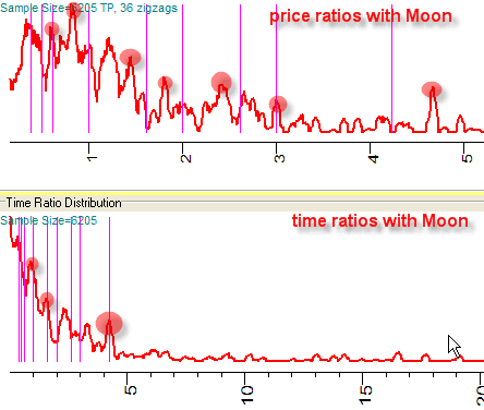
As you see, these histograms are more informative because the peaks are more localized, they are not so messed up as on the previous picture. Mathematically, the narrow high peaks mean the presence of some information, while even diagram means its absence. It is the same like you asked somebody where the office of Mr. Brown is located - you can get the answer "somewhere in Toronto" (which is true though not enough informative), while the answer "Toronto, north of Young, east of Clark" provides more helpful information.
To be sure that this certainty is caused by the Moon phases and not some artifact, I repeated the same thing using random values instead of the real Moon phases. In this case the information just disappeared.
The certainty of this histogram allows to use it as a good helping tool for traders. Practically, it means that we can locate the most active price levels where the trend changes are more probable. More info regarding this see below.
Also we can state that the classical ratios work better for time forecasting than for price. As you see in "Time Ratio Distribution", three purple vertical lines hit three strong peaks. These ratios are: 1 (the duration of an up swing is equal to the duration of a downtrend swing), 1.618 and 4.236.
As per Elliot Theory, we used these values 38.2%, 50%, 61.8%, 100%, 161.8%, 200%, 261.8%, 300% and 423.6%. But in Timing Solution you can add any ratios. They will be shown as vertical lines.
It is very interesting how astronomical factors move the stock market. It looks it is a mistake to research their influence in the terms of direct impact (something like the statement that the price goes up around the New Moon). In many cases, statements like that one do not work. From other side, we cannot exclude them from our consideration - the most reliable models with long term forecast horizon that I have got are based on astronomical models. I believe that we should consider the astronomical influence in the terms of information. In the example above, we have not got a correlation between turning points and Moon phases. The stock market does not adjust its clock with the Moon phases. But it looks like the market geometry depends on Moon phases. The rising and descending Moon provokes the stock market to follow different patterns, and its influence is much more deeper than just simple timing of the turning points.
Actually, it is very simple. Download the price history and run "Turning Points Analyzer" module. In a moment (as always) the program will perform the huge calculations regarding the statistical analysis of your data, and you will get this:
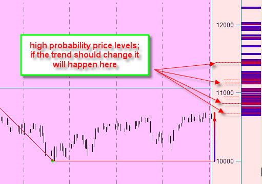
It is an output ready for use. In the right side of the price chart, you can see the colored diagram that represents the most probable price levels where the trend will change. Red regions mean a high probability, the blue ones stand for the low. Besides, you can figure out the risk degree. The blue zones indicate that the price can change its trend on these levels as well. Seldom, but it might happen. His Majesty Fundamental Factor can destroy any market geometry.
Providing more detailed analysis, you can draw these support (blue) and resistance (red) bands:
Even if you have not enough price history and not enough turning points to provide the proper statistical analysis, you can got a valuable information based on previous turning points:

Here we have six price levels calculated from ratios for six previous swings.
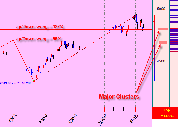
If you have enough historical price information to calculate high probability zones, the major cluster usually provides a very valuable information regarding future price movements.
Look how it works! I have downloaded the S&P ASX 200 for 1983-2006. You can see two the most important clusters there - potential turning points zones. The price chart definitely shows that the price is "stumbling" around these zones. Between them the price movement is pretty straightforward. The momentum is high, while around these zones the price loses its momentum.
What concerns the most typical ratios that rule the stock market,
this question requires special and systematic research. As far as I know there
is no other software that is able to deal with this task but Timing
Solution. Now it is possible to
provide the mathematically correct analysis of this issue.
The first glance definitely
confirms that these ratios:
exist;
they depend strongly on analyzed financial instrument;
it is very important to choose the most informative zigzag.
As a preliminary result of the research for upward swing ratios (ratios between the height of the upward swing and the previous downward swing), we can point out three typical clusters:
1) Very strong cluster corresponding to the height of the up trend swing equal to 93%-98%. In other words, the stock market "likes" changing its trend just before the previous top (2%-7%). Maybe this factor can be explained by specifics of charting. Anyways, the previous top can be used by traders as a basis for drawing the resistance line. Also, the fact that this level is always less than 100% can be explained by traders' psychology - this is a broken resistance line phenomenon. See this advice right from some trader's article: "If support is broken an uptrend, the uptrend is suspect. (http://www.RealMoney.com)". If thousands of traders would think the same and decide that this support line is going to be broken, it will definitely happen (so called "self-fulfilling prophecy").
2) The 120%-130% level.
3) Around 140%.
The pictures below show high probability diagrams for
four different financial instruments. They point out the most interesting
clusters for trading:
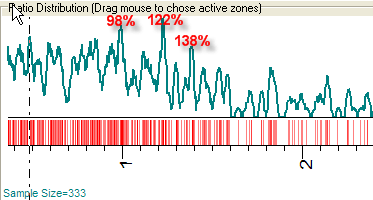
Dow Jones Industrial 1885-2006
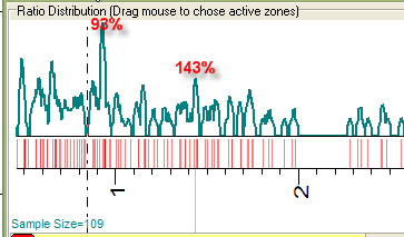
S&P 500 1950-2006
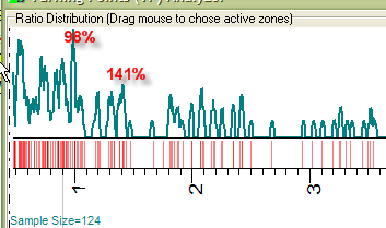
Microsoft 1986-2004
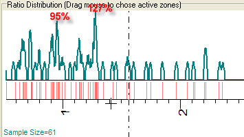
S&P ASX 200 1983-2006
All diagrams indicate that the 93%-98% cluster is pretty strong for all these instruments. The other clusters vary for different instruments (like 122%-127% cluster is very strong for Dow Jones Index, S&P ASX 200 and possibly for Microsoft shares).
The complete description of this module is here: http://www.timingsolution.com/TS/Uphistory/tp.pdf (Adobe Reader file, 800Kb).
You can do your own research, for stocks, futures or indices that you work with. Though the calculations provided by Timing Solution are very complicated, this software is extremely friendly and easy to use. You can rely on Timing Solution accuracy. We tried to automate the calculation process as much as possible - to leave you the most important thing which is think over your choices, get the necessary information and then make your decisions.
Sergey Tarassov and Timing Solution support group
February 5, 2006
Toronto, Canada