The question was asked:
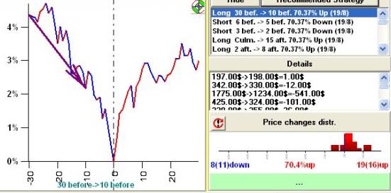
I wish to report for your consideration that, for the asteroids, in the Simple Strategy charts, while the arrow points down, the text describes an "up". I have attached a few charts for illustration.
Answer:
In this example the arrow shows downtrend movement, while simple statistics says that the price during this period went 19 times UP against 8 times DOWN. We can consider this strategy as a risky one.
The possible explanation for this phenomenon may be this one: the price went 8 times down, but either one of them or all were very strong downtrend movements, so the summary effect of 8 downtrends was stronger than the summary effect of 19 uptrends.
Also, considering the simple strategies, be careful with the strategies like this:
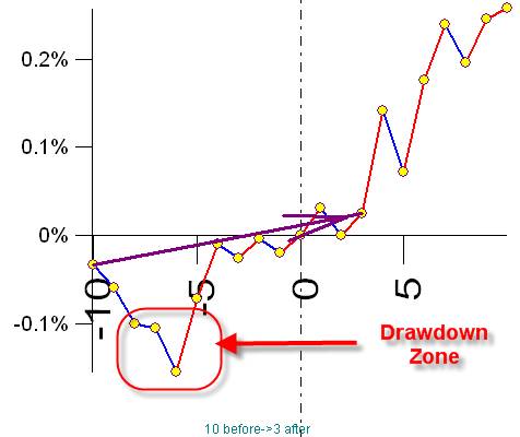
Here the arrow shows the UPTREND movement, while we have a drawdown zone. It means that the price in regards of the event that we are exploring goes up in general. However, between the ends of this buy/sell transaction we face a big drawdown � this is a risky strategy as well.