The main goal of this article is to demonstrate the method used to create the forecasting model based on astronomical cycles and math methods as well. All math related issues that you can skip are italicized.
Here is the report of all cycles that I found important:
| Cycle | Comment |
| 9.1 year cycle | especially strong from 1830 to 1950 |
| 40.5 year cycle | it begins in 1930-1950 yy. It is not enough price history to make reliable conclusions. This cycle is very close to astronomical quarter of Neptune cycle. |
Astronomical Jupiter 11.9 year cycle |
|
Saturn 29.4 year cycle |
may be not so important. |
Saturn-Neptune 35.9 year cycle |
|
Quarter of North Node Cycle - 4.6 years |
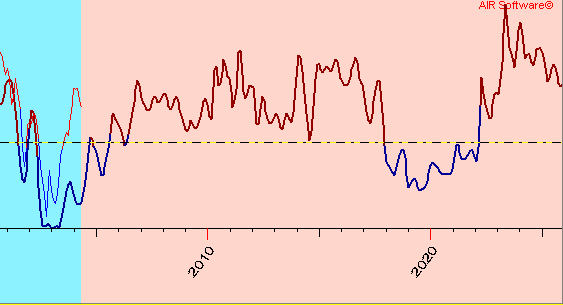
The forecast up to 2023 year has been obtained by two different techniques - Black Box and Composite modeling (both are included into Market Trader):

Fig. 1 Dow-Jones Industrial forecast obtained by Black Box module
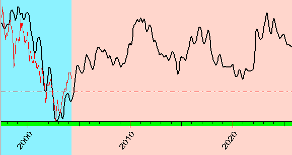
Fig. 3 Dow-Jones Industrial forecast obtained by Composite module
As historical data, we have used the unique monthly data that reflect the state of American Stock Market starting from the year 1789. These data were developed by the Foundation for the Study of Cycles. Bill Meridian has got it in 1988 and has maintained it since that time. For 20 century, these data correspond to Dow Jones Industrial index. Earlier data wes estimated by a special method. To exclude the trend for further research, we have used not the data that they used but one of the oscillators that reflects the long term oscillations of this index. Here it is:
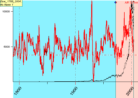
Fig. 3
On Fig.3, the black curve is DJ index, the red curve is the oscillator.
The oscillator is calculated as (Index-MA(Index))/MA(Index) where MA is the
exponential moving average. We have tried to use the different periods for moving average
to be sure that the effect we investigate does not relate to the smoothing procedure. In
these examples we use smoothing period = 50 months.
The first step for any mathematician researching in any time series data is to try the spectrum analysis. It looks this way (we use the period scale in years as an X axis, the Y shows the strength of some particular cycle):
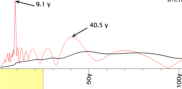
Fig. 4
To calculate this periodogram, I did the Fourier transform of the auto covariance function of the oscillator. To be sure, I tried to calculate the spectrum with the oscillators based on different smoothing periods.
The most strong cycle here is 9.1 years cycle. The peak on 9.1 year definitely points on the importance of this cycle to American economy. Another strong cycle is 40.5 years cycle.
The most common mistake for those who use fixed cycles to produce some projection curve is the assumption that these cycles exist all the time within the observed period. But this is not true. Using the metaphor, we can say that cycles that work for financial markets have their own life time; I have observed this phenomenon for the most financial data available. These cycles are born, get strong and decline (poetically speaking, we can observe the birth, the life and death of cycles). The best way to observe this process is to use the wavelet diagram for these data. For our example, it looks like this:
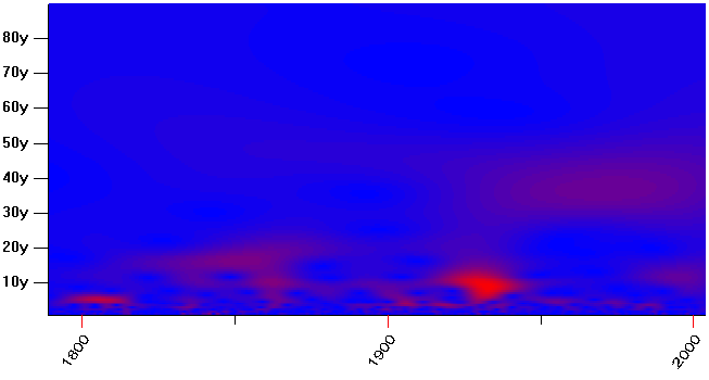
Fig. 5
This diagram demonstrates very well how the cycles live in time. The X-axis is the time, the Y-axis is the period for analyzed cycles. The color shows how strong is some particular cycle at some particular time period. The red regions point the strongest zones, the blue ones are weak zones.
The wavelet transform for relative price oscillator based on complex Morlet wavelet was calculated. Fig.5. represents the period wavelet transform diagram. Do not mix it with a phase wavelet that is used to analyze the unpredictability index (see here).
Now we will analyze the living history of American economy from the point of view of two cycles: 9.1 year cycle and 40.5 year cycle.
Let's start with the first on - 9.1 year cycle. I magnified the price diagram to see the details for this cycle:
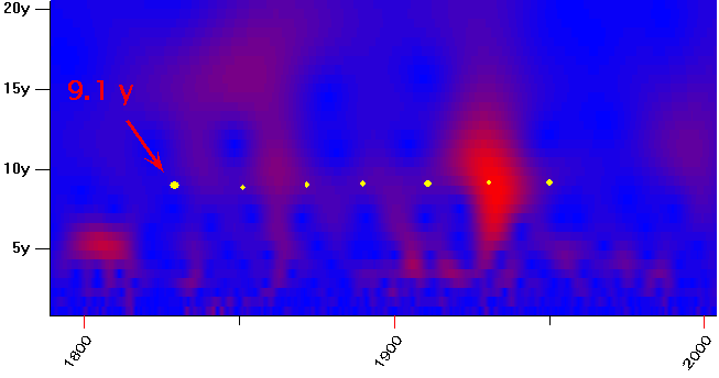
Fig. 6
The presence of long living cycles is shown by the horizontal red stripes. I marked the stripe that correspond to 9.1 year cycle by yellow dots. This stripe is not bright though it exists during quite a long period; this longevity is the most important fact for our task. We can tell that this cycle "was born" around the year 1830. Then it was pulsing through the whole century. It looks like this cycle does not have energy to live after 1950. But after 1980 this cycle revives again (see fuzzy red region), though we do not have enough data yet to tell that for sure. The red bright zone corresponds to the time of the American Great Depression (1929-1941 yy). This bright red area is spreading vertically, too; it corresponds to the strong chaotic movements of the Dow-Jones index at that time.
Now, let us look at another wavelet diagram that reflects the live history of 40.5 year cycle:
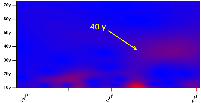
Fig.7
We can tell that this cycle was born right after Great Depression or World War Two. Or, in other words, we can tell that one more important for American economy factor has been revealed in 1930-1950 y.y.
Avoiding any astrological discussion and interpretation, I would like only to point out that 9.1 year cycle corresponds to half period of North Node synodic cycle and 40.5 year cycle corresponds to 1/4 of Neptune synodic cycle.
In comparison to fixed cycles, the astronomical/astrological cycles have irregular structure. Because the planets move not evenly and sometimes might be even retrograde (if being observed from the Earth), these astro cycles give additional dimension to our research which is impossible to get using the spectrum analysis only. In my opinion, the cycles defined by planets are more of a fundamental factor than the math fixed cycles.
The basic technique we use to catch the planetary cycles is the Composite Expert module. The result obtained by this module looks like this:
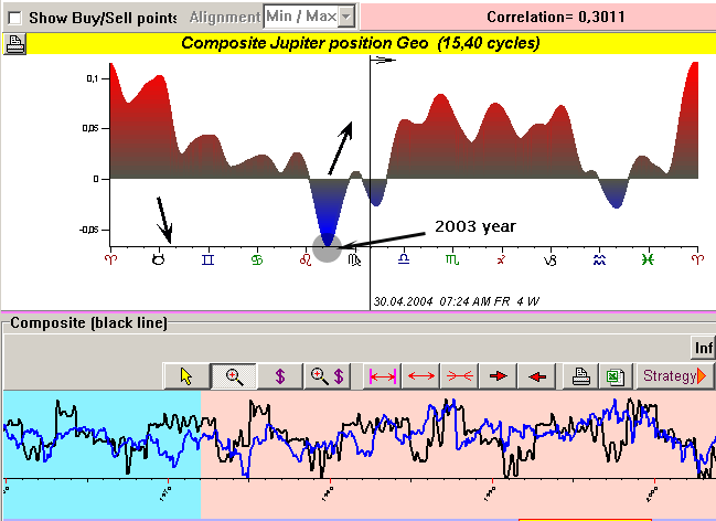
Fig. 8 Jupiter Geo Longitude Composite calculated using data 1789-1972 yy
In brief, the composite is a special kind of a diagram where we can see the change of some analyzed parameter (like DJI, or price, or relative price oscillator) in respect to some astro event (like position of some planet in Zodiac or angle between any two planets). On Fig.8, the upper diagram shows how the analyzed index changes when Jupiter comes through the Zodiac. Looking at this diagram, we can tell that when Jupiter ingresses in Taurus, the DJ index is high and is starting a downtrend movement; when it reaches 15 degrees of Leo, this index is low and starts up trend. The vertical line points our current position (May 2004).
The stock market usually leads the economy by one year. Bill Meridian's study of US economic production over the same time period shows that the economy bottoms when Jupiter is in Virgo. Thus, the finding that the stock market bottoms in Leo makes sense.
We understand very well that the composite gives us the picture "in average", because there are a lot of other factors (and non astronomical as well) that hit the stock market. My modest purpose is only to demonstrate how astronomical factors move the economy.
It is very difficult to specify what astronomical cycles are important and what are not. This problem is not the math problem only, it arises of the fact that analyzing long term periods we have no enough data to produce the mathematically (statistically) correct research. So, in any case, our conclusions will be hypothetical, but providing enough evidence to accept it as a working theory.
To select the playing planetary pairs, I have provided simultaneously two independent tests for each composite:
1) testing the forecast: I have created the composite using points from 1789 to 1972 y.y., and then created the projection line for this composite from 1972 to 2004 yy. The upper diagram shows how I did it for Jupiter cycle. The black line is the projection line for this composite. The correlation on analyzed interval is high enough: 0.3011=30% - that is very good! I would like to mention here that, trying to exclude "future leaks", I do not use price points from 1972 to 2004 to calculate the composite, I use these points to estimate the model's performance only.
2) comparison of two composites created on two different independent intervals: I divided the analyzed data on two independent intervals: 1789-1900 and 1900-2004. After that, I have created composites for each of these two intervals and compared them.
If these two composite give approximately the similar composite diagrams, I would accept this composite model as a working one. Look at this picture:
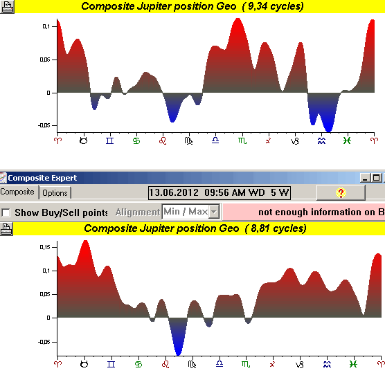
Fig.9
You can see here two composite diagrams, the upper is created on 1789-1900 data, the lower composite is calculated using the data 1900-2004 year. Though they are not identical, there are similarities there: tops and bottoms are almost the same (for example, Jupiter in Taurus - downward trend; Jupiter around 15 degrees of Leo - upward trend starts for DJI)
Considering that 15 degrees of Leo is very important turning point, see this diagram (Jupiter trajectory for 2002-2003 yy):
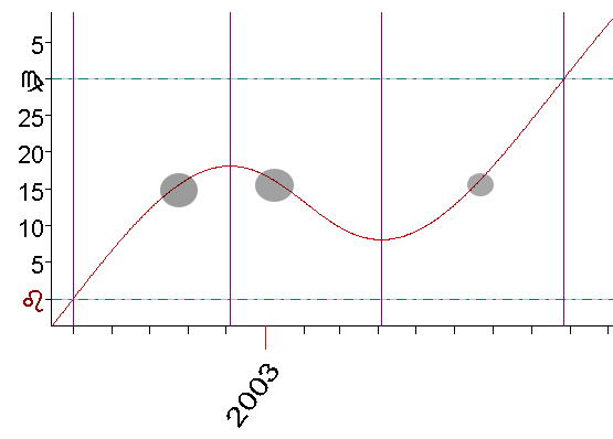
Fig.10 Jupiter trajectory
Repeating this procedure for other planetary composites, I have picked up these composite cycles:
1) Jupiter Geo Longitude (picture above)
2) Saturn Geo Longitude:
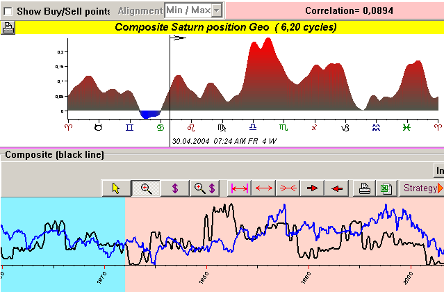
3) Angle between Saturn and Neptune (Geo Longitude):
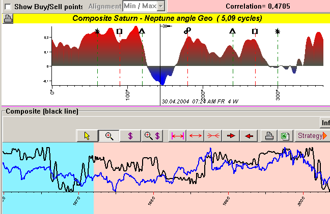
4) Quarter of North Node Cycle:
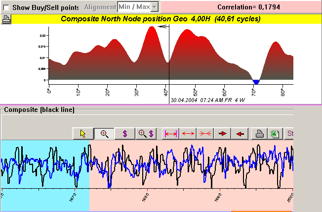
Actually, applying more wide criteria, it is possible to specify more cycles, but to create the forecasting model I decided to use only the most important ones.
For example, here is the composite based on quarter (4H) of Neptune cycle:
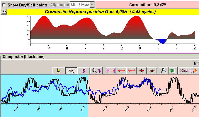
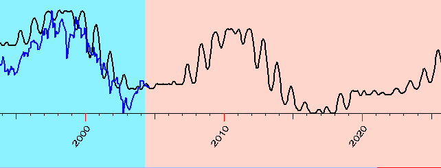
You can see it gives very good coincidence (84%) on testing (red) interval. But it looks like this cycle becomes active only in the second half of 20th century (as we have got through the spectrum analysis and wavelets above).
This is the projection line based on single 4H Neptune cycle:
Considering the Neptune cycle as a very important one for the last 50 years (I cannot state it because we have not enough data for such a conclusion; this issue has to be researched over years), I calculated the composite for a quarter of Neptune cycle. Astrologically, this composite reflects Neptune's position in crosses calculated for DJI index from 1950 to 2000 y.y. Here it is:
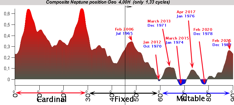
I marked some turning points by red arrows. To understand better what is going on we can concider the composite diagram as a memory of stock market regarding to the position of the planets above. When any planet comes through some point on Zodiac, the stock market somehow "remembers" it . While time is going on, new "memory" of the event is added to the previous one, making this cycle stronger. Then something totally new occurs (like slow moving planets ingress another Zodiac sign), and the memory of the past starts to fade; the cycle is weak and ceases to exist.
So, the dates for turning points in the past are written in blue, while the dates for future turning points are written in red. Though I do not know for sure that the DJI will follow this composite only, but at least we should keep these points in mind.
I analyzed the long term cycles only. Analyzing the smaller time interval of daily data for DJI (1915-2004), we can point out another cycle - Jupiter-Uranus business cycle described in "Money and the Markets" by Graham Bates and Jane Chrzanowska Bowles.
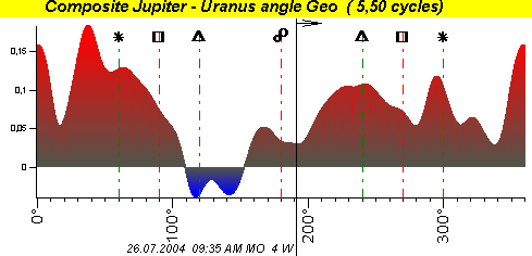
But it looks like this cycle was not so important 100 years ago, so I did not use it for the calculation of the forecasting model.
Summarizing these composites all together, we can get a long term forecast based on planetary cycles:

Applying the same planetary pairs to another module, we have got this result:

To get the whole picture, look at this projection line obtained by another method. This method is the extraction of the most power cycles from the spectrum (10 cycles):
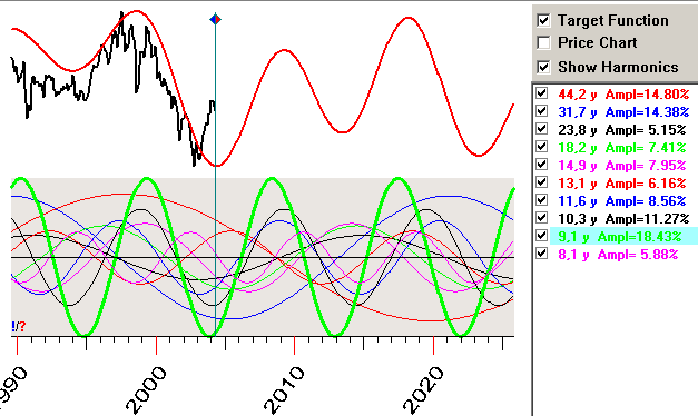
The downward trend of 2000 is described by all models. In any case, American Stock Market is now in upward trend.
May 30, 2004
Sergey Tarasov