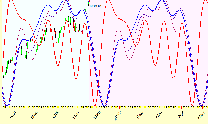
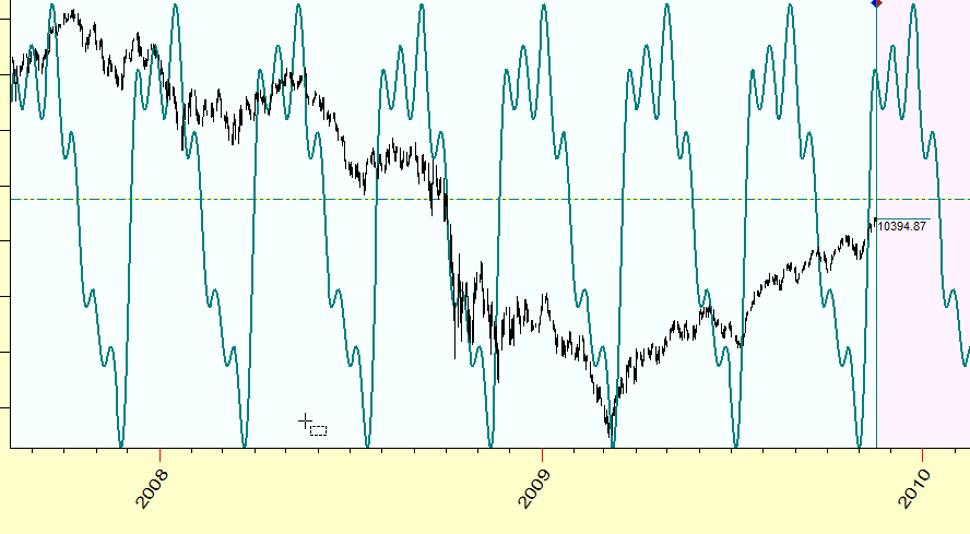
DJIA, cyclical analysis November, 18 2009
Time Machine
When I read the descriptions of the majority of research materials on cyclic analysis of the financial data, I always experience one and the same feeling. It is the feeling that we live now not in the 21th century, but somewhere in the beginning of the 18th century or maybe in the 17th century. These papers make me feel living long before Joseph Fourier's invention of Fourier analysis (which has occurred in the beginning of the 19th century), long before Arthur Schuster's invention of spectral analysis (in the year 1898, and this idea has been strongly developed during the 20th century as the tool to handle noisy data), and long, long time before John Ehlers's attempts to apply these methods for tricky financial data (which allowed us to speak in terms of "dominant cycles"). Having computation abilities that these great thinkers could not even imagine, we still use techniques that would be more typical for medieval ages.
Definitely the technologies I recommend here are not a Holy Grail, but they allow to make the research faster, more accurate, and more confidently.
So, when somebody says that cycles with %X length rules
some market's behavior, first thing that you can do is to look at the spectrogram/periodogram
for this market.
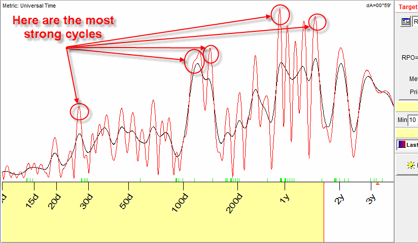
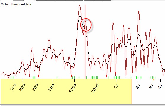
It looks typically like this:
The peaks on this diagram represent the most power cycles for your financial instrument (your chosen market), these are the cycles that describe your financial data in the best way.
The spectrogram is not some kind of a trick. It is pure mathematical procedure. And it does not matter how you measure the period of this dominant cycle (Low-Top or Low-Low or Top-Top, I have checked this fact). This procedure is a very sensitive instrument to reveal cycles. You can trust the computer to do it. And it is for you to choose the peaks; then you can easily find the periodicity of the corresponding cycles (simply look at the X-axis). You can measure the periods in calendar or trading days or use more specific metrics (it depends on the type of calculations you plan to do).
Plus, in Timing Solution software, a special algorithm has been developed to handle very noisy financial data.
What conclusions can we make looking at these diagrams?
Everything is going faster now
If we compare the periodogram calculated prior the latest Financial Crisis (let's say, in May 2007) to the periodogram calculated now (November 2009), we see the important difference between them:
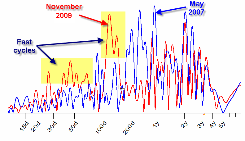
The red periodogram (November 2009) indicates the presence of short term cycles (with periods less than 200 days): there are more peaks there, especially for the cycles with the period around 100 days.
It means that more energy is concentrated in these cycles, i.e. they play more significant role in the stock market behavior within the last two years of the crisis.
Dangerous point
Here we speak in terms of "dominant" cycles. Dominant cycles mean that these short term cycles work now, though they have not worked two years ago. The problem is that now we cannot say when these cycles will stop working and when the new cycles will come. We always should remember about this thing.
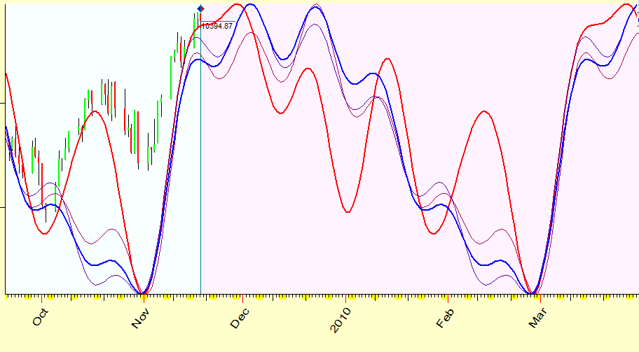
Forecast
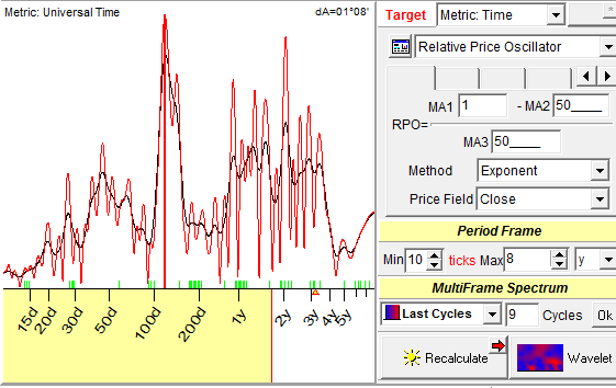
I believe the most prominent cycle now is 117 days cycle. This is the screenshot for Timing Solution users with the options that I used to calculate this periodogram:
This is how it worked in the past:
and here are four versions of future forecasts based on this cycle:
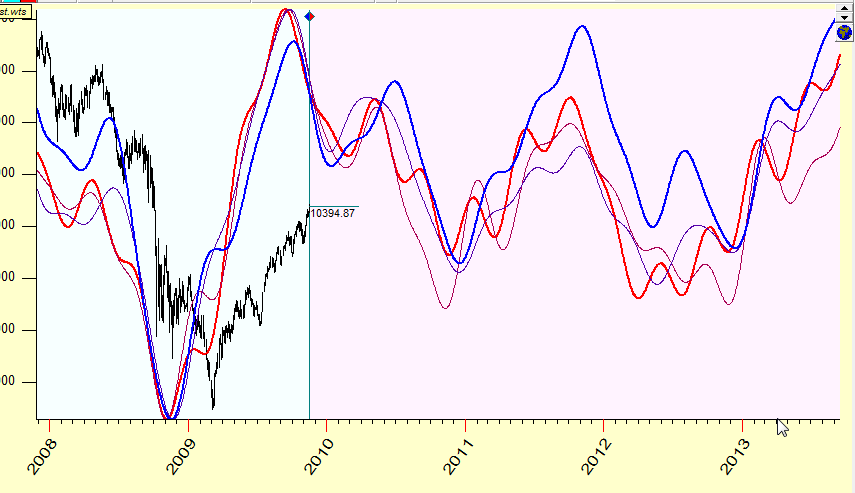
Economical cycles
To see the bigger picture, this is the forecast based on major economical cycles:
Dark horse
I also would keep an eye on 141-day cycle (which "lives" very close to 117 days cycle, it is very weak so far):
This is how this cycle sees our future :