Solar System Center of Mass (CM): case study
written by Sergey Tarassov
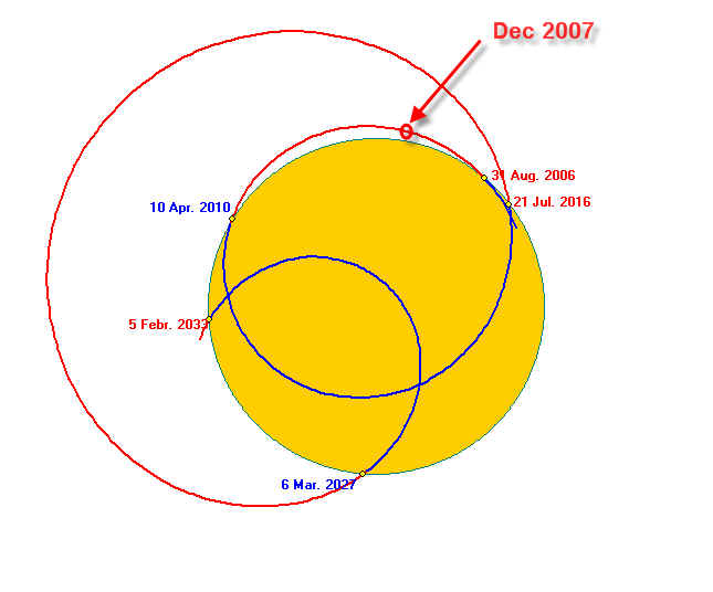
Solar System Center of Mass (CM) is the center of mass of our Solar System. Due to the fact that the planets constantly rotate around the Sun, the center of mass constantly changes its position. The most interesting fact is that this point makes its dance around the Sun's disk. See how CM moves in years 2006 - 2033:
The yellow circle represents the Sun's disk. As you can see, sometimes CM dances just around of the Sun's photosphere (from August 2006 till April 2010 - a red curve). Then it dives into the Sun's disk and makes passes inside the Sun (April 2010 to July 2016 - a blue curve) and after that makes very wide figure outside of the Sun's disk.
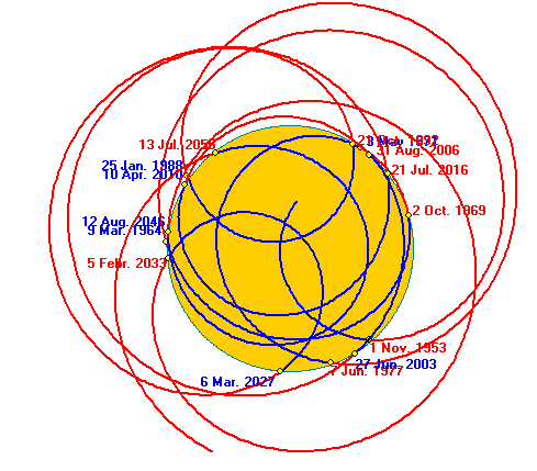
To see the beauty of this dance, we need to watch it during at least a hundred of years. See how trajectory of Solar System Center of Mass's looks in a wider time frame (years 1950-2050):
Is there any connection between CM moves and the stock market? If such a connection exists, we may use it to predict the future of the markets. In this small article, I will conduct a case study for CM and show possible ways to use this point to forecast different financial data. I am not a pioneer here; I only continue the work that has been started by Theodor Landscheidt and is described in his excellent book, "Sun-Earth-Man".
Who are the major performers of this dance?
First of all, this it is the Sun itself. It possesses 99.8% of the mass of our Solar System. It keeps our dancer (CM) totally under its control, allowing them from time to time to make the figures outside the Sun's photosphere.
Second player is the heaviest planet of our System, Jupiter. Jupiter dictates to our dancer its 12-year rhythm. This is important as the rhythm is very important issue for dancing.
Saturn and Neptune, the next heaviest planets, add a variety to this dance. They add the sense of the art to this dance, otherwise the dancer will be just running rounds.
Other planets add some nuances visible mostly to the professionals.
Let look at this dance in details. As I said, Jupiter defines the rhythm of this dance. Look at CM and Jupiter ephemeris:
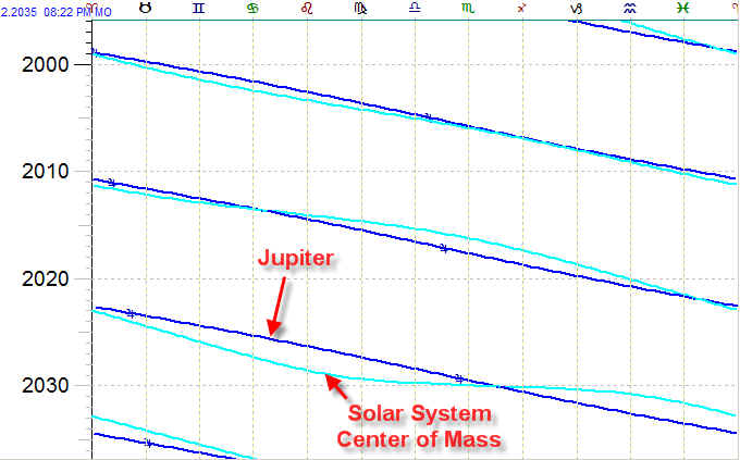
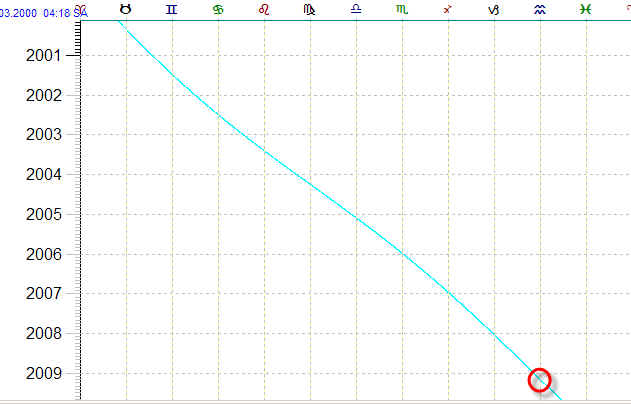
They are pretty close. However, once in every 150-200 years something terrible happens. The dancer does not follow the direction pointed by Jupiter and moves retrograde. This the trajectory of Solar System Center of Mass for the last 200 years:
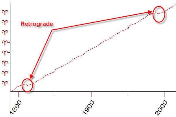
You see here that CM has been retrograde in 1811 and 1989 years. This is how it moved in 1811 year:
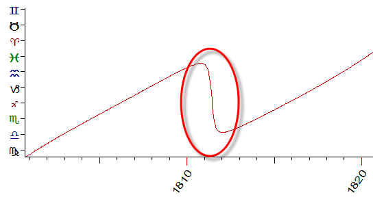
Occasionally or not, two years after 1811 the Napoleon Empire ceased to exist as well as the Communist regime in Russia (two year after 1989).
Now let us look at our dancer pairing some financial instrument.
It looks like the CM has some impact on Consumer Price Index (CPI). I have the CPI data for Great Britain. The data used cover a period from 1666 till now. In some book, I have seen a diagram for that same index, starting from the year 1450. Unfortunately, I do not have these data and would be happy to get it. I would like to mention also that this research is NOT an illustration of some econometric theory. I simply look at these data from the point of view of mathematics and astronomy.
Let us start. Below is the diagram that represents CPI, as per our data file. The first attentive look at these data reveals that CPI's behavior has changed significantly in 70s (XX century). It became rising a lot faster than it did three hundreds years before:
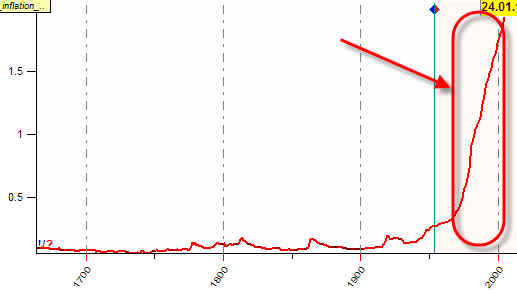
IMHO this is caused by the fact that money and gold have been separated at this time (Bretton Wood conversion has been abandoned). So I conduct the statistical research for the data from the year 1666 till 1950.
Below I draw the radius of Solar System Center of Mass (a blue diagram) together with the variation of CPI factor (a red curve: oscillator with period=5 years):
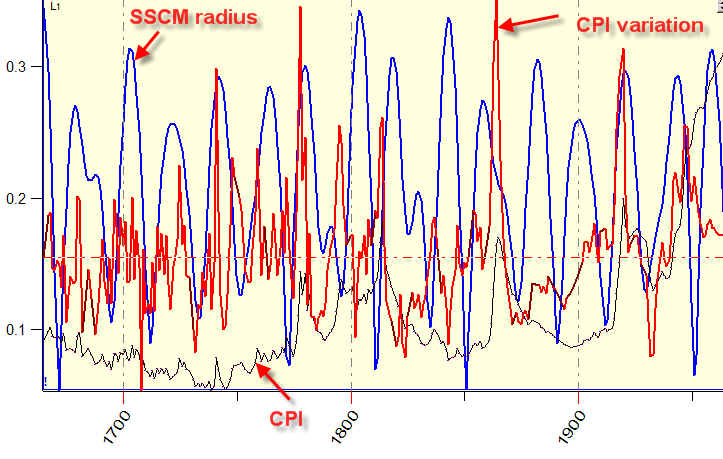
As you see, there is some coincidence between the blue (CM) and the red (CPI variation) peaks. It is not ideal; however it is present. The mathematical analysis shows that these two diagrams (CM radius and CPI) correlate to each other, and the correlation coefficient is 11%. It means that the further CM is located from the Solar center, the higher inflation we have. When the dancer is under the Sun's control and makes some figures dancing inside the Sun disk, the inflation tends to be smaller than at the times when these figures are performed outside the Sun.
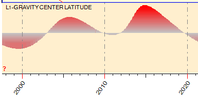
Much more interesting results are provided by the analysis of the latitude of the Solar System Center of Mass. See it below, together with CPI:
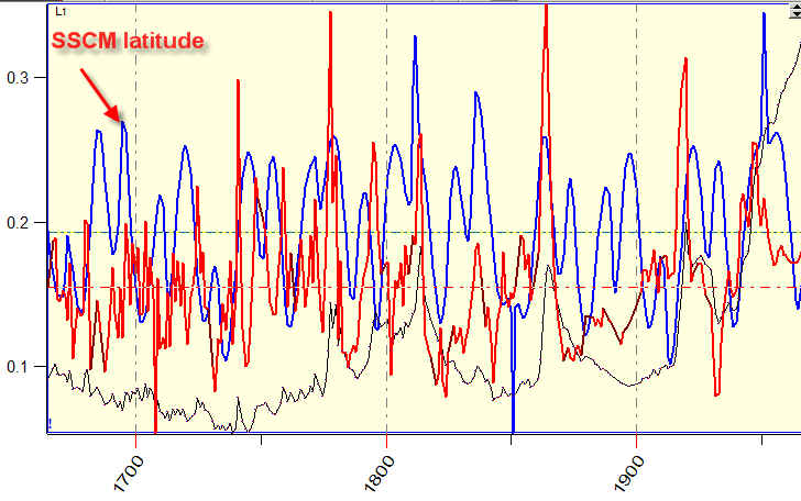
The correlation now is about 30%. It means that these two factors are related with a high probability. Practically it means that the higher CM is inclined to the Ecliptic, the higher inflation we have. I think we can improve these results using Jupiter Ecliptic instead of the Earth's Ecliptic.
This is the CM latitude for 20 years of this century:
At least two years already I have seen many forecasts regarding the coming hyperinflation for the next year (it was said about 2006, 2007, and 2008), predicting the gold price at $2000 and the oil price at $200, together with many other terrible things.
I believe and hope that all war/economics/liquidity problems will be solved smoothly, the Cosmic weather gives us some chance for that.
Once again, remember that this is not an econometric analysis, it is the analysis of only one factor, CPI for Great Britain - because of the available long term data. Other inflation related indicators (like PPI, M2 index) simply have not enough recorded history data to make any long term forecast.
All our programs allow to calculate a position of the Solar System Center of Mass. It is marked by the same symbol as the Moon in heliocentric coordinates:
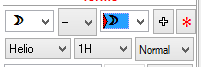
This object has no relation to the actual Moon, we simply use this symbol in heliocentric coordinates.
Thus we can use CM in the standard procedures of financial astrology. For example, we can make a composite diagram that shows the Dow Jones Industrial Index movements in respect to the CM position. Here it is:
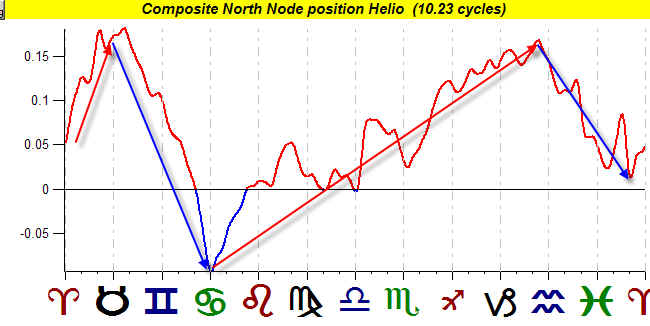
The data from 1885 till 2007 are used to calculate this diagram. More detailed analysis shows that the most reliable tendencies are:
a) DJI goes up when CM is in Aries;
b) DJI goes down when CM is in Taurus and Gemini;
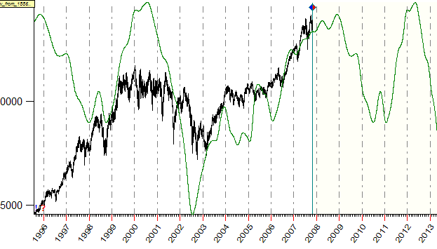
The effect of all other areas of the diagram is rather mixed. This is how the composite diagram works in time (the green line):
For your information I put the ephemeris for CM:
The last phenomena related to the Solar System Center of Mass that I would like to mention is its conjunction with Jupiter (in ULE module, the corresponding event is: the Moon conjunction Jupiter Helio). This phenomenon takes place approximately once in 10 years. It usually has downtrend impact on the stock market. The Efficiency Test shows that within a month around this conjunction Dow Jones goes down (12 times down versus 1 times up):
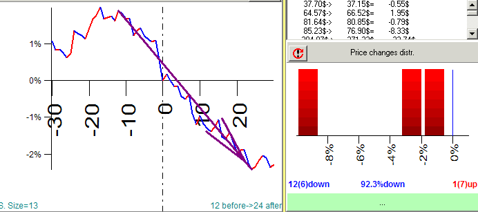
Remember that this aspect takes place approximately once in 10 years. For me this fact is very interesting because for years I try to find some rational explanation to 9-year Juglar cycle.
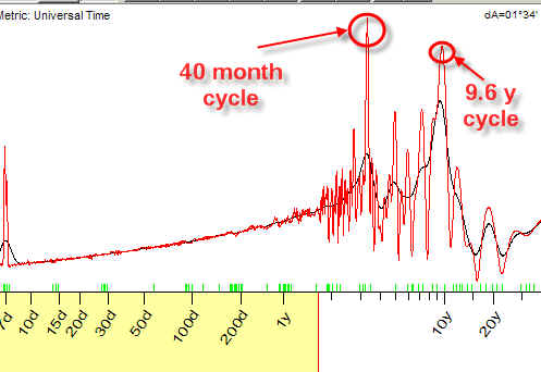
The analysis of many financial instruments shows that almost all of them contain one of these economical cycles:
1) 40 months Kitchin cycle and 2) 9-10 years Juglar cycle. These cycles are visible in the spectrogram for Dow Jones index:
So far I am not sure about the nature of this cycle. Maybe, it is a half of the Moon Node cycle; maybe it is related to the Jupiter's conjunction with CM cycle.....