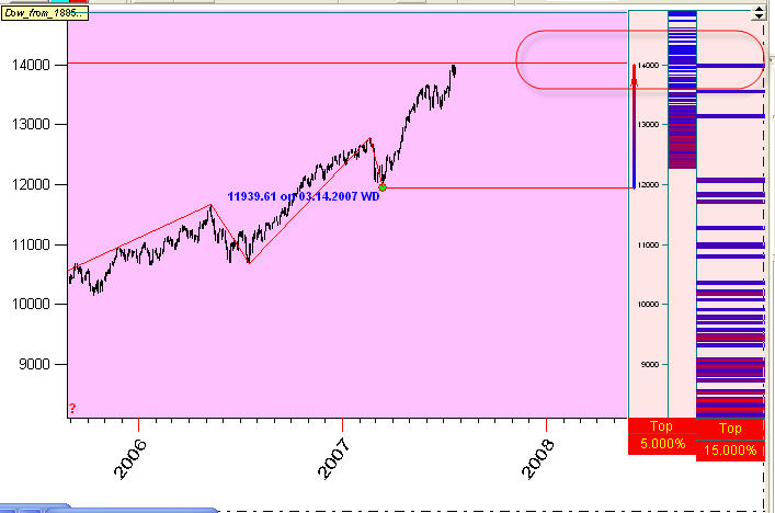
Dow in July 24, 2007 looks impressive. There were many discussions in the Internet at least for half a year already. A lot of people were anticipating the upcoming market correction. July's Dow does not confirm it: it continues to grow. The reason why I write this article is a pattern that I have found using the turning points analyzer module. (The details regarding this module of Timing Solution software is described here http://www.timingsolution.com/TS/Articles/waves_in_moon/waves_in_moon.htm and here: http://www.timingsolution.com/TS/Articles/tp_1/tp_1.htm)
This is the diagram provided by this module:
It shows the most probable price zones where the next top turning point may occur. Red zones are the most active.
I like this module - simply because we use a pure statistic approach to calculate these zones, putting aside any preliminary assumptions. Here two vertical rulers represent zones calculated by 5% and 15% zigzags (calculations are done for Dow data from the year 1885, it is a very representative statistics).
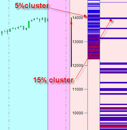
See the red cluster around 14000 level; it is confirmed by both 5% and 15% high probability diagrams:
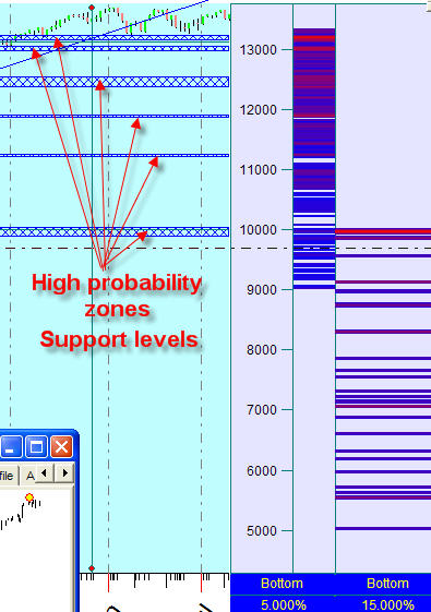
Next question is: "if this would be a top, where the next bottom may be
located?". In order to answer this question, let us force the program to set
its next top to the
1421.95 as it has been reached at July 17, 2007. Set this option "ON": ![]() .
The program will use this bar as a top and analyzes the next possible down swing.
.
The program will use this bar as a top and analyzes the next possible down swing.
The possible support levels for upcoming correction look like these:
How long will last the current uptrend? I know only one cycle that can confirm it: Neptune's 4th harmonics cycle (with the period of 41 years). I have found it analyzing a long term price history (from the year 1789). This is how it looks like:
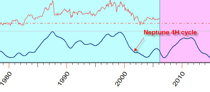
However, I think that this scenario is less probable than the one discussed above.
July 24, 2007
Toronto, Canada
Sergey Tarassov