Dynamic Cycles
To my mind, the most important fact in the financial analysis that have become obvious within the last decade is the understanding that the cycles existing in the financial data can be considered as dynamic cycles only. For example, if we say that 57 trade days cycle makes the weather on the stock market within the last 6 months, it does not mean that this cycle has worked a year ago and it does not mean that this cycle still will be working the same way in a year from now. We have to accept the fact that the life of any market cycle is very limited in time. It means as well that we have to readjust our models constantly revealing the cycles that work now and the cycles that do not work anymore - exactly like in the politics.
In this article I will explain how to deal with this phenomenon from a practical point of view. As an example, I took Dow Jones Industrial Index data since the year 1885 till November 2009.
Revealing dominant cycle
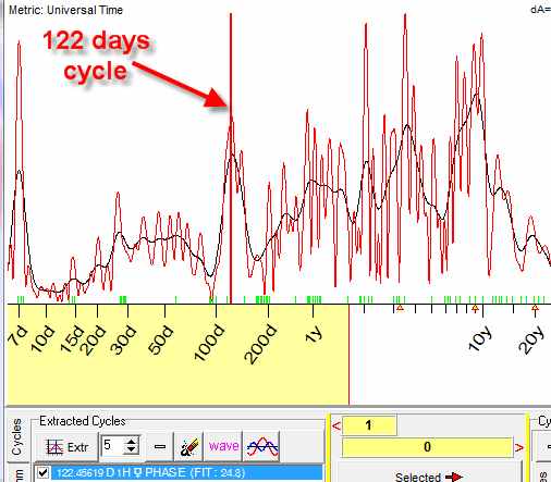
The spectral analysis provided by Timing Solution software indicates the existence of 122 days cycle:
Practically it means that within the last 122 x 7 days (i.e. two and half years) this cycle is strong (here we used multiframe spectrum with stock memory=7, see here more about it: http://www.timingsolution.com/TS/Mini/47/index.htm).
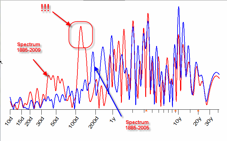
The important fact for us to remember is that this cycle has appeared the last two and half years. If we would calculate the same spectrogram four years ago, i.e. for the same data since 1885 till 2005 only, we would not find this cycle. See below the comparison of these two spectrograms (the red one is calculated for the period 1885-2009 while the blue one is for 1885-2005):
.
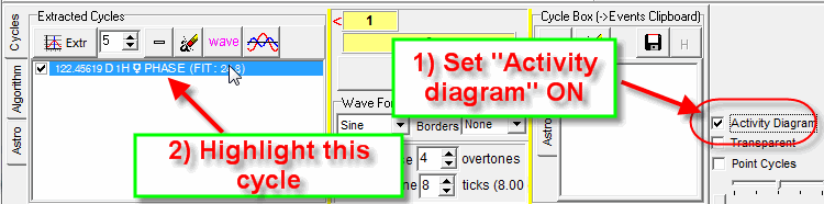
Now, when the cycle is revealed, we need to know how this cycle works in time. Simply "drag and drop" this cycle in the Main screen (here is the detailed explanation how to do that: http://www.timingsolution.com/TS/Study/E/4.htm):
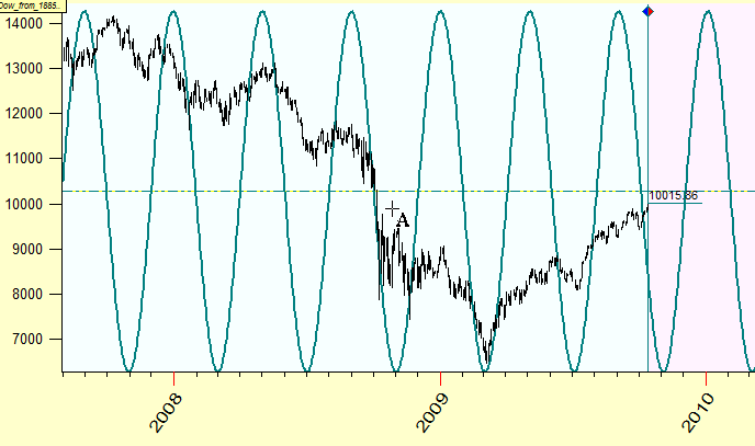
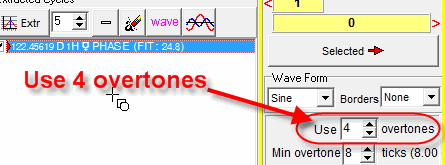
For this example I did not use overtones, i.e. the pure sinus curve is displayed. To see this cycle in details, add more overtones here:
and "drag and drop" this cycle in the Main screen once again:
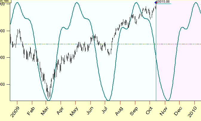
Now you are able to see what this cycle forecasts.
Finding analogies in the past
Next step of our analysis is finding historical analogies, i.e. finding the periods in DJIA history when this 122 days cycle has been as strong as now.
In Spectrum module follow these steps:
The most similar periods are marked by red bars:
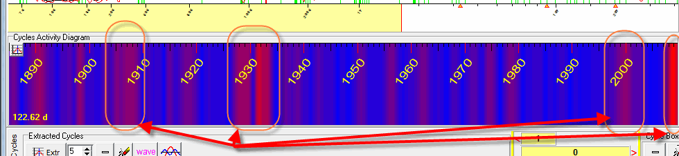
It looks like these periods were very critical for American economy/stock market. In other words it looks like that this cycle becomes active in critical periods, all other time it is not active.