Wavelet analysis - cycles early warning system
Cycles do not live forever
When you hear that some cycle, let's say with a period of 105 calendar days, is strong for some particular financial instrument, - you always should ask what time span is used to reveal this cycle. The fact that it is impossible to find the cycles that consistently work in the stock market should be accepted as a scientific fact. There are special math procedures that immediately reveal any constantly working cycles (if they only exist), and this analysis does not leave any chance for the existence of constantly working tradable cycles. Though this analysis reveals the existence of long term cycles (Annual, Kitchen, Juglar cycles), but these cycles are too long for traders.
Does it mean that the cycle analysis is not applicable for the stock market? No. Definitely not. We have to accept that cycles live their own "lives": they are born, they live and finally they die. The cycle's life time is limited, and we need to deal with this fact. As I know, historically the first one who applied this approach to the stock market was John F. Elder; it is known as MESA analysis. We are developing this approach further. So let's start ...
What a wavelet is?
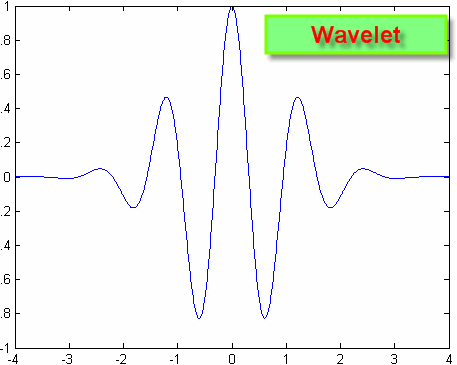
A wavelet is a wave limited in time; it is a piece of some regular wave. In the picture below you can see a regular wave together with the wavelet:
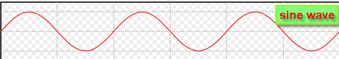
While the regular wave is not limited in time, the wavelet exists within some finite time interval. The wavelet technology has been developed a lot in 1990s. It is used a lot nowadays: for example, when you call using your cell phone, in reality the cell phone packs your speech as a bunch of wavelets, this approach allows to lighten up the traffic a lot.
Wavelet diagram
For the stock market application of this idea, the most important feature is wavelet diagram. This is the example of this diagram:
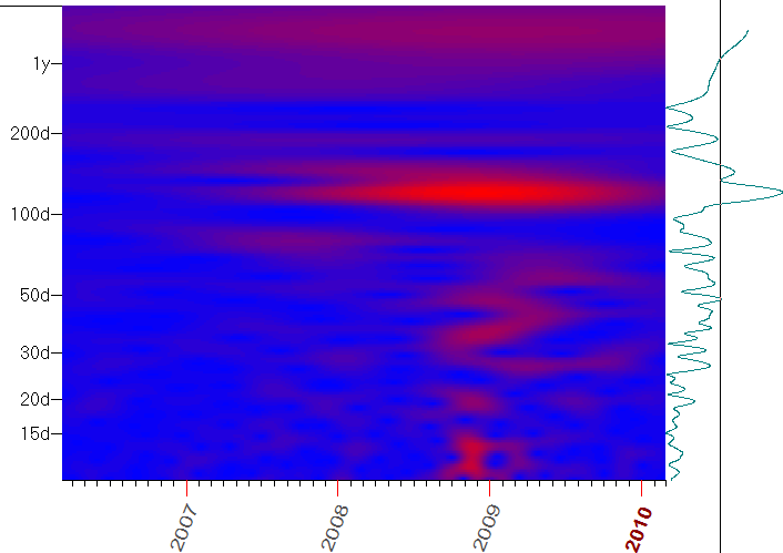
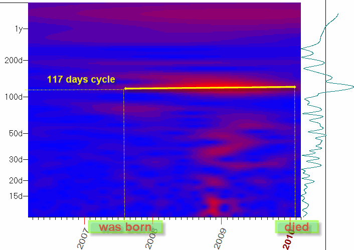
You can take the wavelet diagram as a history of the cycle's life. It shows the bio of any cycle right away: born at XXXX, did something within YYYY, died on ZZZZ.
The horizontal red/yellow stripes represent here the cycle's BIO, its lifetime length. The horizontal axis represents TIME while the vertical axis shows the PERIOD of this cycle. The hot (red and yellow) zones represent active zones - the periods when cycles are active.
Looking at this diagram, we can say that the cycle with the period of 117 calendar days has been active on the stock market since the middle of 2007 till the beginning of 2010:
So looking at this diagram we
can easily say how many cycles are active on the stock market now and the bio of
the each cycle (whether it is newborn, young and strong or old and weak).
Look at another horizontal red stripe, it corresponds to the period of 189 days:
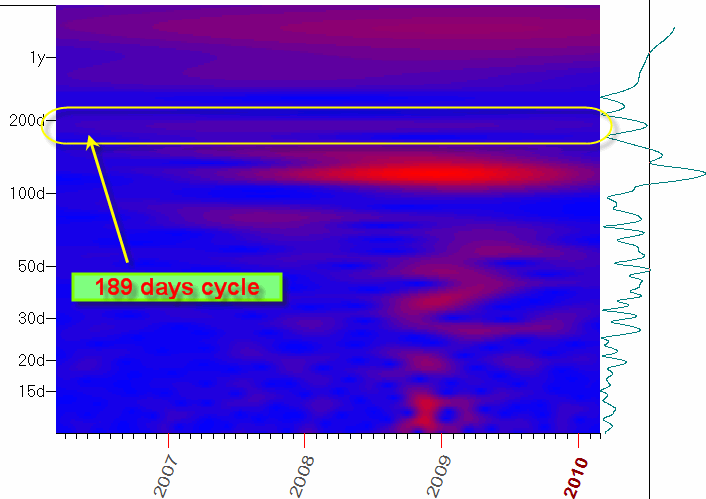
This cycle is not so strong (the stripe's color says it, it is not so bright as for the 117 days cycle), however it looks like this cycle is active at least from the year 2007.
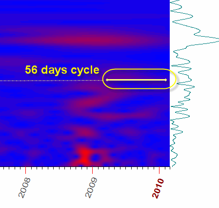
It might make some sense to pay attention to the 56 days cycle as well:
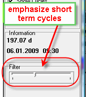
To emphasize short term cycles, you can vary the position of this slide bar:
So, our goal is to reveal the cycle as early as possible. When the cycle becomes obvious for all, this is a sign that this cycle is weakening, and its time is over (this is the way how the Efficient Market Theory is working in the cyclic analysis).
The system of early warning
I have found a good analogy in military. They have such a thing as a ballistic missiles early warning system; this is the system that finds the enemy missiles as early as possible. Similar to that, our main goal is to reveal the young and strong cycles as early as possible, otherwise this cycle being unattended can destroy any of our trading strategies.
You can take the wavelet technology as a system of early warning for the trader: when some new cycle becomes active, the red horizontal stripe appears on the wavelet diagram. This is the "red alert", and you need to pay some attention to this cycle. Just watch this cycle, we don't know how long this cycle might live.
Technique
The technique is very easy here. It is based on the "drag and drop" cycle model; this approach is explained in this class: http://www.timingsolution.com/TS/Study/Classes/class_spectr_1.htm
In brief, this is how it works:
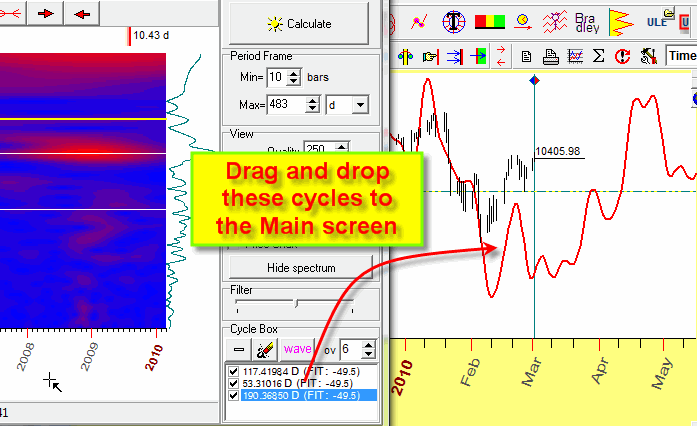
a) on the spectrum diagram, pick up the most influential cycles; they correspond to peaks of the diagram. Just make a mouse click on the spectrogram around those peaks;
b) drag and drop these cycles from the Cycles box to the Main screen (or click
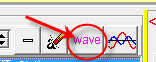 button);
c) the program will calculate the projection line based on these cycles:
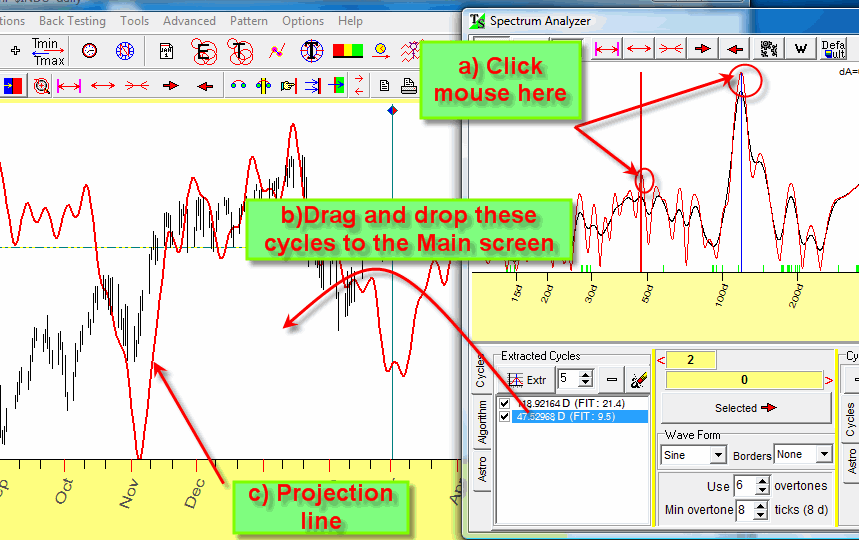
d) I recommend to vary the amount of overtones and the stock market memory parameter:
Now we perform the similar procedure with the wavelet module.
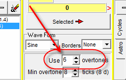
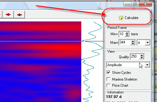
Run the wavelet module, it is in the Spectrum module of the program:
click "Calculate", and you get the wavelet diagram like this:
You can hide the spectrum module now clicking on this 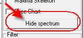 button. From now,
you will work with the wavelet module only.
button. From now,
you will work with the wavelet module only.
Move the mouse cursor to some red stripe that represents the strong cycle and make the left mouse click:
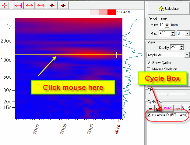
As you see, the program puts this cycle into the cycle box and marks this cycle by horizontal line on the wavelet diagram.
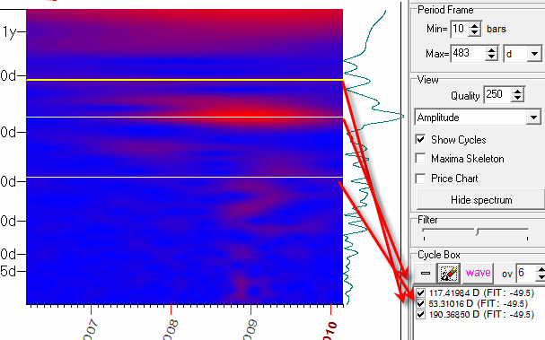
You may choose several cycles:
Now drag and drop these cycles from the Cycle box to the Main screen (or click
 button), and the program will immediately calculate the projection line based on
these cycles:
button), and the program will immediately calculate the projection line based on
these cycles:
I recommend to vary the amount of overtones:
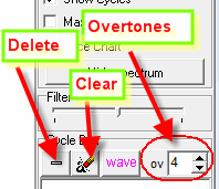
You can also remove any cycle from "Cycle Box" ("Delete" button) or delete all cycles ("Clear" button).
I recommend to pay attention to the "age" of the cycle. The age of any cycle is calculated in its period. For example if 10 days cycle is active within the last 30 days, we say that the age of this cycle is 3 full periods (3x10=30).
If we consider another cycle with the period of 100 days that is active within the last 200 days, we say that the age of this cycle is 2 periods. I recommend to take into account the cycles that are active 2-3 periods at least. To see the age of any cycle, look at the red bars while moving the mouse cursor through the wavelet diagram. These 3 red bars cover a time interval of three cycles:
The red stripe on the wavelet diagram should cover the time interval of 3 cycle periods at least.
The rules to pick up cycles are:
1) the stripe should be bright (red or yellow color)
2) the stripe should be long enough (in time) and cover at least 2-3 full periods of the cycle
3) the hot zone should be narrow
If calculations are too slow
We recommend:
1) to download not the whole price history, but only the most recent price history:
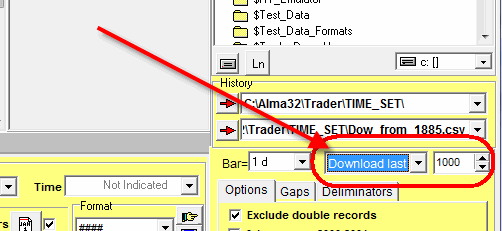
1000-2000 last price bars is enough.
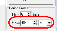
2) try to decrease the maximum period:
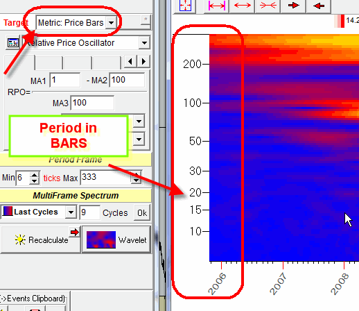
Note for intraday data
For intraday data, the program automatically switches on the bar metrics, in other words the period of the cycle is measured in bars (not in hours, days ...). Accordingly the period vertical scale on the wavelet diagram shows us the period in bars: