Smart charting tools in Timing Solution
Overview - smart charting tools
Overview - smart charting tools
As any technical analysis program, Timing Solution provides you a big collection of charting tools. You will find there Fibonacci retracements, Andrews pitchfork and its different variation, trend lines, support/resistance lines, Fibonacci ellipses, Gann fans and many others; all these standard tools are available in Timing Solution:
And there is something else that makes a difference between Timing Solution and other programs with charting tools. Our "know how" are new smart charting tools. You do not just draw a pitchfork or some other charting tool together with the price chart - this can be done with any technical analysis software. Timing Solution does much more: it analyses available price history and adjusts the charting tools accordingly.
Also, there is another category of charting tools - astronomical/astrological charting tools. These charting tools are based on different principles than standard math applications; they use astronomy's rules. Some of them are just the continuation of traditional charting tools. The difference comes mostly from a special way of dealing with the Time.
Time is measured here in degrees of the angle separation between two planets or in degrees of the planetary position of any single planet. Mostly, we measure the time using the atomic clocks. But we could do it with other things- like using trade days (instead of calendar days) or price bars. Or we could use the Moon phases or Venus phases. What time measurement is more appropriate? It depends on the task we deal with. If we analyze some physical, chemical, or other similar process - no doubt, the time measured by the ceasium-133 atoms oscillations is more suitable. However, for the processes where human activity is involved - like the stock market - I do not know how appropriate atomic clocks are.
Thus, we apply different time measurements for different tools. As an example, in "Equidistant lines" charting tool we measure time in DAYS (calendar or trade days), while for "Planetary equidistant lines" we measure time in planetary angles.
The good part about astro based charting tools is that you do not need to have some special knowledge. Timing Solution has it for you. While you drag the mouse through the screen, the program performs very complicated astronomical calculations and immediately updates astronomical patterns on the screen. All this job is performed by the program fantastically fast.
Now, look at these examples.
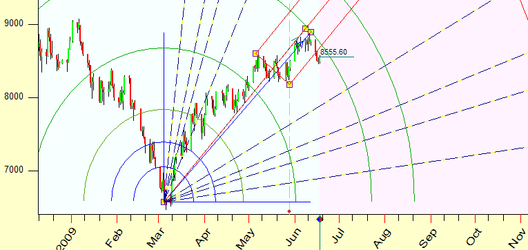
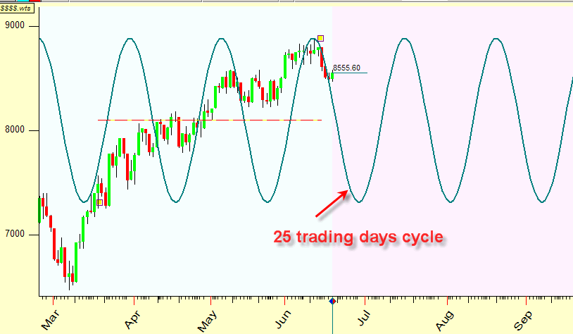
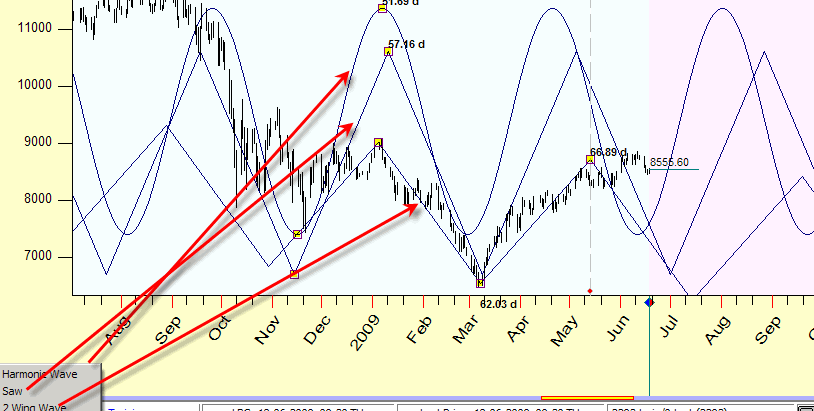
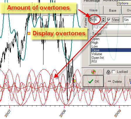
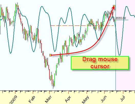
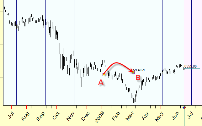
Suppose you have guessed that within last five months 25-trading days cycle dominates. And you plan to use it in your trading. How to do that? Normally, you would do it applying some standard math program. Definitely it would take some time and requires some special knowledge from your part. With Timing Solution, this is just several seconds of your time, and no special knowledge. You choose "Fourier harmonics" charting tool, set 25 trading days cycle there and simply drag the mouse covering five months interval. The program automatically adjusts 25- trading days cycle for covered price history:
If you want to take into account seven months instead of five, you simply drag the active anchor covering additional two months. If you want take into account more harmonics, just point the amount of harmonics - and the program updates your chart immediately. You can take into account as many cycles as you want.
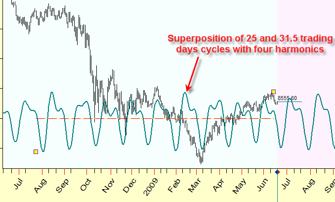
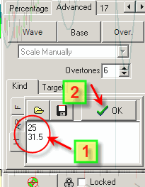
Here you can see superposition of 25 and 31.5 trading days cycles with four harmonics:
And you are not required to understand all complicated math behind Fourier analysis; what you are required is just drag the mouse cursor.
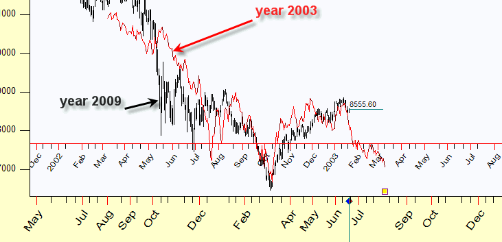
Another kind of charting tools allows to search similarities in price patterns. Suppose you have decided that the current price chart (June, 2009) resembles the price chart January 2003. Is it true or not? With Timing Solution you can check this statement quickly. Use "Price chart slice" charting tool; it overlays the price chart January 2003 on top of your current price chart. You simply use your mouse dragging this piece of the price chart:
Going further, you can display together the same price chart one, two, three ... years ago, revealing Annual pattern:
Here you can see the current chart together with the price chart (2009) for years 2008, 2007, 2006, 2005 and 2004.
or you may apply more advanced astronomical cycles - like displaying the piece of price charts for the moments when the phase of Mercury has been exactly the same as it is now:
As you see all these charting tools are suitable for forecasting, because they are able to analyze past price history and apply this knowledge to the current situation.
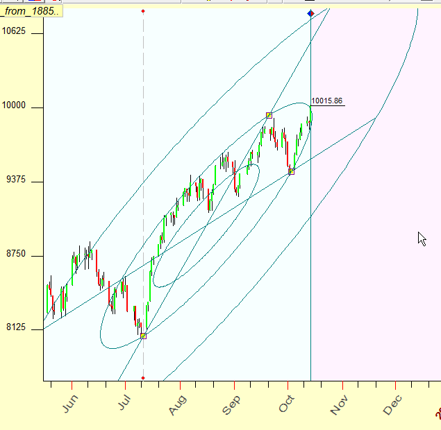
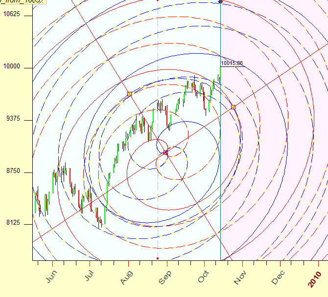
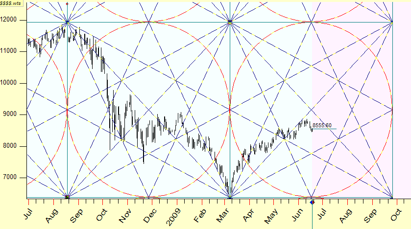
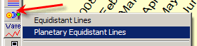
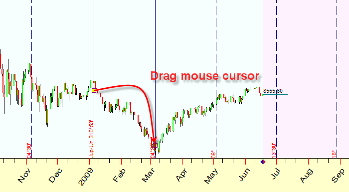
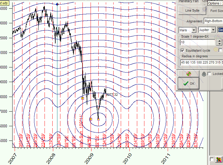
There is one more (new) charting tool that is very popular - "planetary equidistant lines". On the picture below vertical stripes correspond to the moments of the angle change between Jupiter and Uranus heliocentric on 4 degrees 30 minutes:
In other words these stripes mark increments of the angle between Jupiter and Uranus heliocentric on 4 degrees 30 minutes. Users use this charting tool to reveal astronomy based patterns and locate turning points.
This article is a description of all charting tools available in Timing Solution. They are are divided on standard, advanced and astro based charting tools.
Drawing charting tool
Here you will find the general rules of using any charting tools with Timing Solution. This topic concerns mostly interface issues. So if you read this article for general overview, you may skip this topic (click here).
All charting tools are situated on the left side of the Main window - because they are tools that are not statistically verifiable. See this set of buttons; you are able to draw the most popular charting elements here:
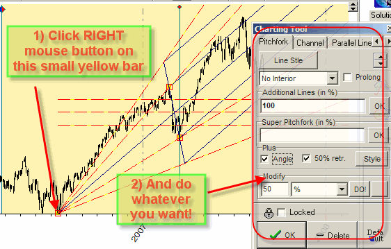
Let us draw one of them, Andrews pitchfork. Follow these steps (they are pretty much the same for all charting tools):
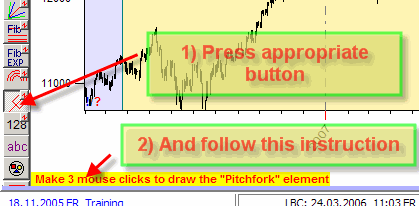
For this particular tool, three mouse clicks define its anchor points (the anchor points are marked by yellow bars):
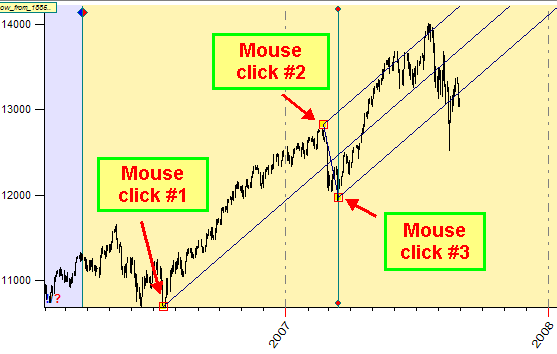
For any other charting tool, the appropriate instruction defines its anchor points.
Aanchors
Pay attention to these small yellow bars; they are "anchors":
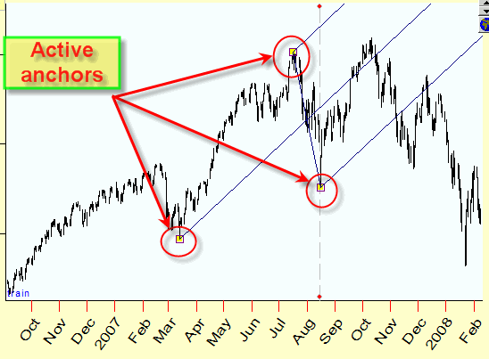
Setting the mouse cursor on some of the anchors and clicking LEFT or RIGHT mouse button, you can MOVE THESE ANCHORS or MODIFY PARAMETERS for any charting tool related to these anchors.
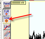
If "Snap" button is pressed, the program automatically sets the anchors to the nearest highest high or lowest low and important points :
While you move the mouse cursor around these active points (highs, lows, anchors and important geometrical points), the program "catches" them automatically and sets the mouse cursor EXACTLY to these points (these active snap points are marked by colored cycles):
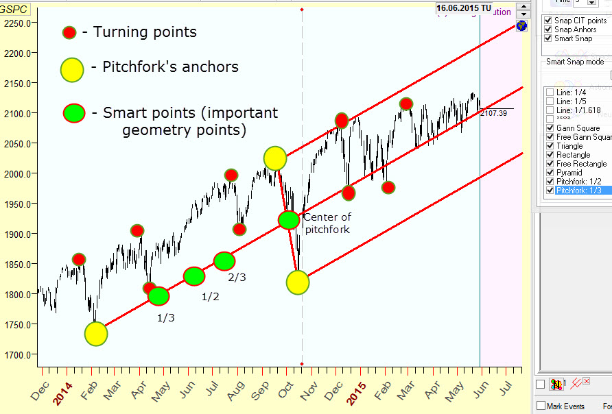
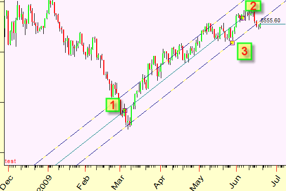
For example, you can easy draw trend line that connects low A (December 2013) and geometrical point B (center of pitchfork, October 2014):
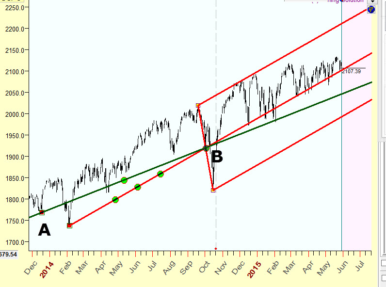
Simply move the mouse cursor through these points and program automatically sets cursor to exact position.
Here you will find more explanation regarding snap feature: http://www.timingsolution.com/TS/Study/Snap_mode/
Modification of a charting element
You can move the anchors this way:
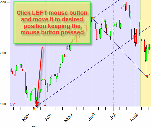
Moving a charting tool:
In the example above, we moved one point only.
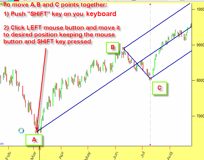
However, it might be necessary sometimes to move the whole figure, i.e. moving
all points A, B and C.
In order to do that, do the same as above while moving the point A,
keeping the Shift button on your keyboard pushed. Thus you can move the
whole figure:
Setting options for a charting element
Any charting tool can be modified. See how to modify our pitchfork:
Two anchors charting tools
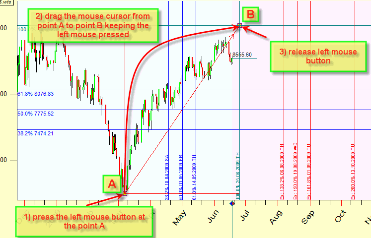
The Andrews pitchfork requires three anchor points. Some charting elements require two anchor points only. For example, to draw Fibonacci grids simply drag the mouse from one anchor point to the other one's (1) press the left mouse button at the point A; 2) drag the mouse cursor from point A to point B keeping the left mouse pressed; 3) release left mouse button)
As with the pitchfork, using the RIGHT mouse button, click on any yellow anchor bar to modify your Fibonacci grid (colors, price/time grids, marks):
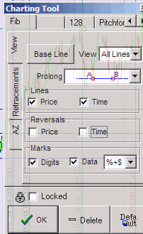
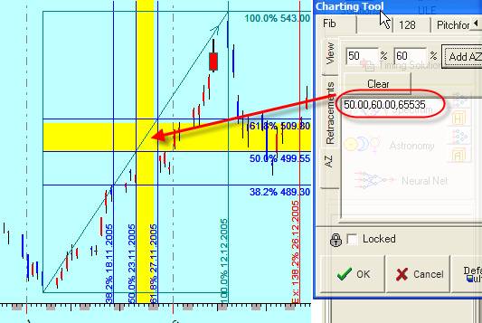
In "Retracements" tab you can add new retracement line and set the color and width for any of these lines:
Remember: when you do all these changes, the program immediately updates the charting tool in the Main screen, so you can easily see how these changes affect the charting tool.
The tab �AZ� (active zones) allows to mark not just lines but the whole zones. Like here the zones 50%-60% are marked by yellows stripes:
"Default" setting
Clicking "Default" button saves chosen parameters for the charting tool "as default":
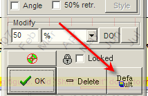
It means that next time when you would like to draw a pitchfork (as an example), previously chosen color, width, retracements will be applied.
Fast access buttons
Also pay attention to this small "fast access" button:

Clicking this button, you can use the charting tool without displaying the option window; it saves one mouse click.
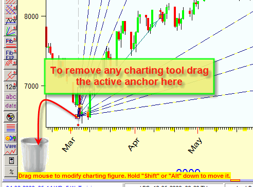
Erasing the charting element
You can easy remove any charting tool this way:
Charting panel
Clicking "Panel" button:
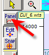
you get the :Charting Panel" window:
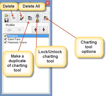
Here you can save or download charting elements, delete them, make a copy of any charting element, lock/unlock them.
Multiselection
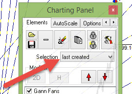
Very often several charting tools have very closely located anchors, like in the chart below. You can see that there three charting tools have the anchor located practically at the same place:

In this case when you modify the anchors
position by dragging the mouse cursor, the program picks up ALL closely located
anchors. So, while dragging one anchor, you actually move three anchors (in this
example).
If in "Charting Panel"-> set "Selection" option to "Last created", you will move the anchor for the last created charting tool ("Harmonic wave" charting tool in this example), and all other charting tools will be unchanged:
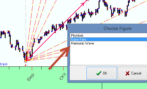
If you highlight "From list" option:
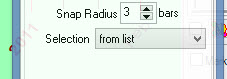
the program will ask you what charting tool you are going to modify, like this:
![]() Trend line. This is the simplest charting tool. It connects two
points of the price chart:
Trend line. This is the simplest charting tool. It connects two
points of the price chart:
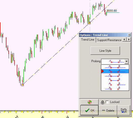
The only parameters to vary here are: color/thickness of this line and the type of prolongation of this line.
![]() Channel. To draw this charting tool, you need to make three mouse
clicks. First two clicks define the basis line, and the third click defines the
channel line:
Channel. To draw this charting tool, you need to make three mouse
clicks. First two clicks define the basis line, and the third click defines the
channel line:
![]() Parallel lines. Three mouse clicks - and you can draw the bunch of
parallel lines like this:
Parallel lines. Three mouse clicks - and you can draw the bunch of
parallel lines like this:
or choosing ![]() Grid item draw the grid like this:
Grid item draw the grid like this:

![]() Support/Resistance level draws horizontal lines like this:
Support/Resistance level draws horizontal lines like this:
![]() Gann
fans draws Gann fans, like this:
Gann
fans draws Gann fans, like this:
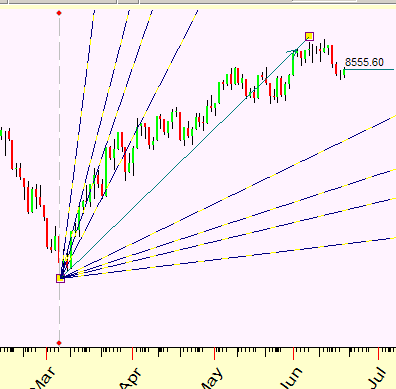
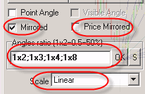
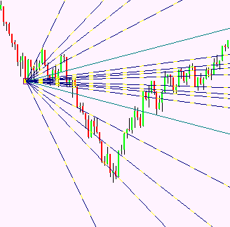
You can use different angles there ("Angles ratio" parameters), display mirrored lines:
This is a sample of the price mirrored fan:
Using these buttons  you
can modify the color of the base line and fans; remember that you can also specify the color for
each fan separately:
you
can modify the color of the base line and fans; remember that you can also specify the color for
each fan separately:
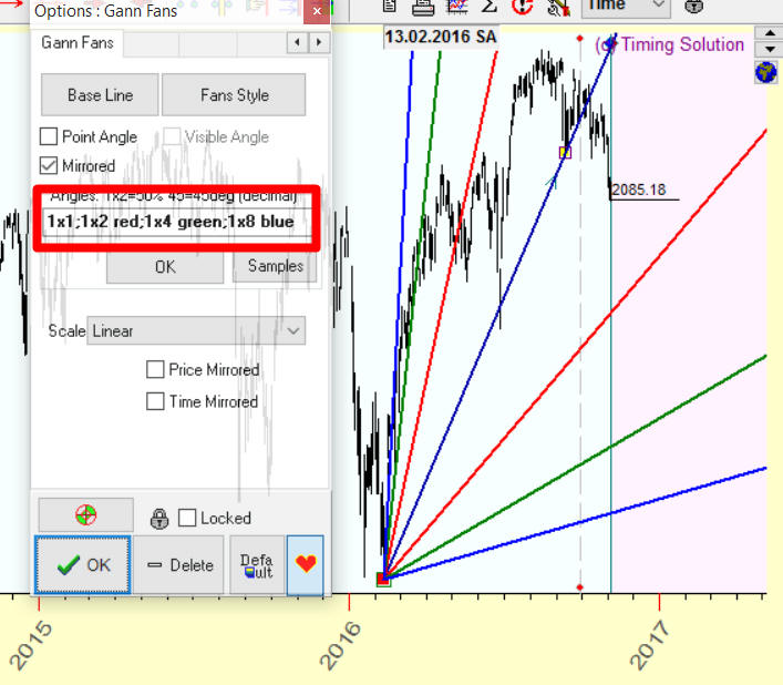
In this example, for 1x2 fans we used red color (1x1;1x2 red;1x4 green;1x8 blue), 1x4 - green color (1x1;1x2 red;1x4 green;1x8 blue), and 1x8 - blue color (1x1;1x2 red;1x4 green;1x8 blue).
Fans are separated by semicolon symbol ; while between the fan ratio and the color the space symbol is used.
These colors are allowed:
Red
Blue
Green
Lime
Black
White
Gray
Silver
Yellow
Aqua
Teal
Olive
Maroon
Navy
Fuchsia
Orange
Purple
You can also add Dark and Light words before the color name. For example: LightGreen or LightLightGreen or DarkGreen or DarkDarkGreen.
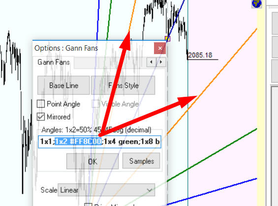
Besides, you can use much more colors using RGB colors table with appropriate hex codes. The RGB table is in appendix at the end of this article.
For example, look at "dark orange" color in this table; its RGB hex code is #FF8C00. So, to display as an example 1x2 fan using dark orange, type this:
1x2 #FF8C00
If you need to display actual angles (like 45 degrees or 60 degrees angle) simply type this:
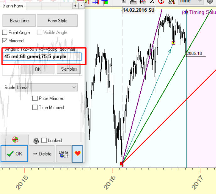
Here we display 45 degrees angle (red), 60 degrees angle (green) and 75.5 degrees angle (purple). Pay attention, we use decimal notation for angles, i.e. 75.5 means 75 degrees 30 minutes.
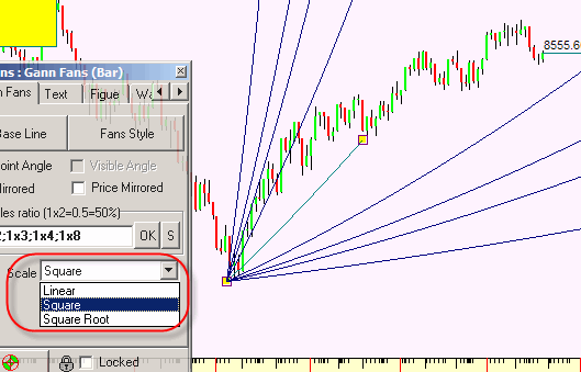
You can also use square or square root scale for these fans:
![]() Fibonacci
grid allows to draw grids like this:
Fibonacci
grid allows to draw grids like this:
Define in the options window a type of the grid (price, time or both), display/do not display reversals grids:
You can enable/disable retracements or define your own retracement:
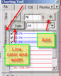
For example, if you plan to work with 70% retracement, type 70 and
click "+" button here: ![]()
If you need to change the color or thickness of any retracement line, you can easily do that making a double mouse click on the retracement that has to be modified:
You can set separate color for each retracement as well.
![]() Fibonacci
ellipses allows to draw ellipses like this:
Fibonacci
ellipses allows to draw ellipses like this:
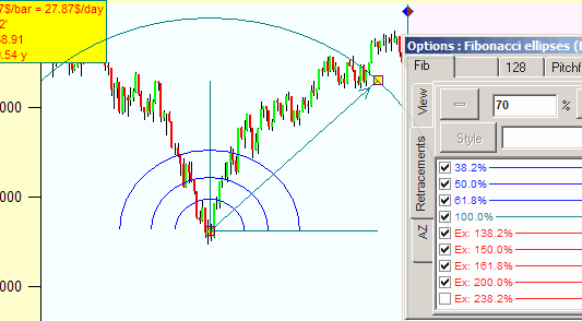
The radius of these ellipses correspond to Fibonacci proportions. As with Fibonacci grid charting tool, you can use your own proportions for these ellipses.
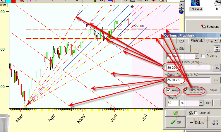
![]() Pitchfork
Pitchfork
This is a sample of classical Andrews pitchfork; in Timing Solution you can draw it with three mouse clicks:
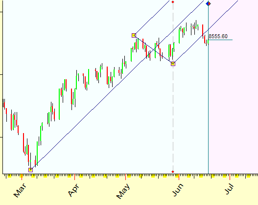
Here are all possible variations of this pitchfork asked by Timing Solution users:
![]() You can place any text or data mark with these charting tools
You can place any text or data mark with these charting tools
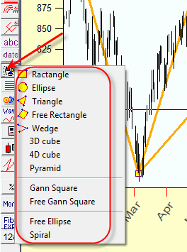
Geometrical figures
Geometrical figures are here (see the menu above). You can make different combinations of them:
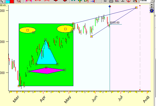
Free Ellipse
Spiral
and it's variations:
3D Cube
4D Cube
Pyramid
![]() Advanced support/resistance lines
Advanced support/resistance lines
This option allows to display advanced support resistance lines, like pivot point, equilibrium point. More about this module is here: http://www.timingsolution.com/TS/Uphistory/supp_resist/index.htm
You can construct your own support/resistance lines as well.
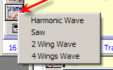 Waves
Waves
Here they are:
More -> Gann Square
Here it is:
More -> Free Gann Square
Here it is:
 Fourier string
Suppose you touch the guitar string, and it starts vibrating. How many different sounds do you hear?
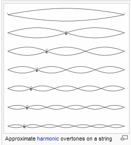
First of all, you hear the main vibration of the string; on the picture above this is the upper vibration involving the whole string length. Besides, you hear the vibration of the half of the string length; it is the next "octave" of the main sound. Also you hear 1/3, 1/4 .. length vibrations. These "additions" to the main sound are called overtones. Some overtones sound loudly while others are very quiet; it is the reason why every musical instrument makes its own unique sound.
This fact inspired Jean Baptist Fourier to develop Fourier analysis which considers all processes in our Universe as a variation of some string vibration. We can use the charting tool that is nothing else but the application of this idea to the stock market.
Follow these steps:
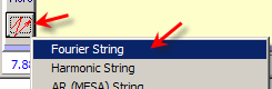
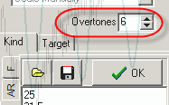
1) Choose this button:
and highlight the item "Fourier String"
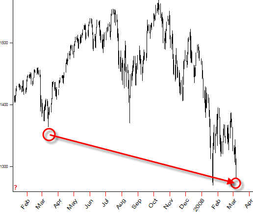
2) The following is very important, pay enough attention to it. You need to choose a string. As an example, I analyze S&P500. I choose the string that starts at March 14, 2007 (bottom) and continues up to the beginning of March 2008:
Drag the mouse connecting these two points. Thus you tell the program the length of the analyzing string. It is the only thing that you have to do. Then you will see how the stock market plays this string.
The most fascinating feature of this drawing tool is that you can see immediately how "sounds" this string touched by S&P500:
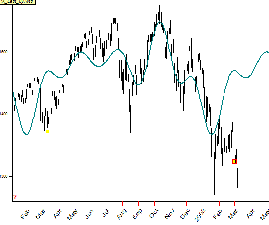
While you drag the mouse, the program performs a huge amount of calculations: it does Fourier analysis and displays the projection line based on this analysis. If you try any other software package to perform the Fourier analysis, you have to click some buttons, define parameters, etc - every time when you would like to do Fourier analysis. Here your dragging the mouse from one edge of the string to another makes the program to perform this procedure hundred times. With Timing Solution Advanced, you can "touch" these cycles literally by your hand.
Now some recommendations:
a) the most important thing is to find the appropriate string (i.e. the time interval). Be ready that sometimes it might be impossible: the stock market might start playing a totally new song that has not been played previously.
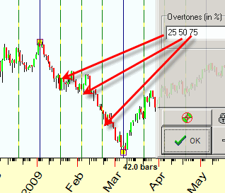
b) to enrich your projection line, you may increase the amount of overtones:
"View" option allows to display these overtones separately.
c) for the data with a strong trend component (like it is in our example) I recommend to vary "Target" option:
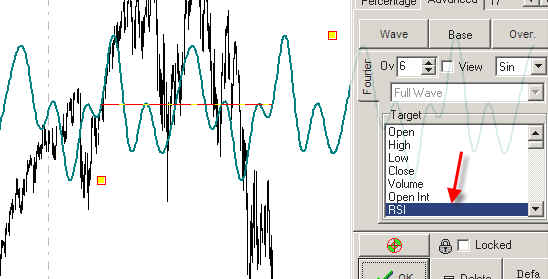
Here I set RSI as a target, thus the sound of our string is generated by RSI (which is not a trend indicator; therefore we avoid the trend effect).
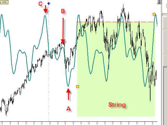
d) while drawing the string, try to cover turning points outside the string (points A, B, and C in our example):
e) You can vary waveform option:
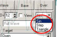
In the example below I have downloaded Dow monthly for the last 100 years. Set the triangle waveform; as a target set the oscillator with the period of 50 months, let the amount of overtones be 4:
Do that, and you get "a la Armstrong" business cycle forecast:
The most used options here are the string length (a basic cycle) and the amount of overtones.
 Harmonic string
Let's continue our musical analogy. Suppose you know that during last three months two cycles are dominating, 25 and 31.5 trading days. In other words, stock market plays two sounds now: 25 and 31.5 trading days sounds. You can consider it as a musical instrument with two strings. In comparison to Fourier string charting tool, the lengths of these strings are fixed, we do not change the basic sounds. This charting tool allows to visualize how the music of this two strings' (or any) instrument sounds for any market. Or, in other words, this charting tool allows to see several fixed cycles' effect.
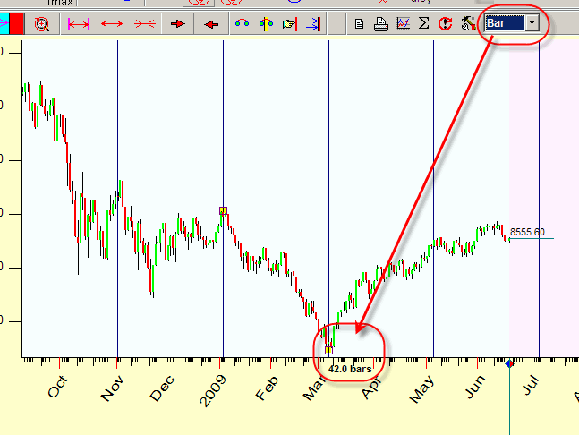
With Timing Solution you can do it in a few seconds. Because you use trading days (not calendar days), set BAR scale here (this is especially important for intraday data):
Choose "Harmonic string" charting tool and drag the mouse cursor covering last 3 months of the price history:
In charting tools parameter:
1) set the length of analyzed cycles and
2) click OK :
Try to vary the position of the active anchor covering 6 months, 1 year ... of the price history and watch how the projection line (sorry - music played by two strings) is changing.
Here 6 months of the price history are covered:
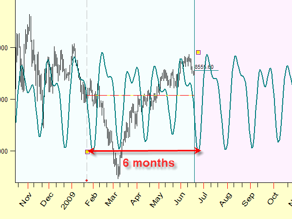
The projection line has been changed. The music made by these two strings depends on covered price history, the minor tune from a longer perspective can be converted into major tune for a shorter period.
As you see the "Fourier string" and "Harmonic string" charting tools provide a forecast for the future, the projection lines are prolonged beyond the last price bar.
Here are recommendations regarding the usage of this module:
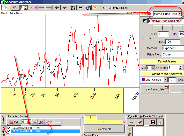
a) use Spectral analysis ("Spectrum" button) to reveal dominant cycles. Here you can see how 25 and 31.5 dominant cycle are revealed (do not forget set "Price Bar" metrics in the Spectrum module):
b) vary the covered interval and watch how the projection line is changing;
c) you can enrich the projection line increasing the amount of overtones:
 Price chart slice
This charting tool allows to find the periods in the price history with similar price charts.
It covers a popular idea of periodicity and similarities in the economic life. You often hear something like this: look at the Dow price chart in 1908 and at the Dow now (2008); there are some analogies, - and then the conclusion comes. With this new tool, you are able to check these ideas quickly; and any time you can display different pieces of the price chart.
In comparison to the two charting tools described above, this one requires some manipulations provided by you. You have to do four mouse clicks and some scrolling. Let us do them together.
Your first step is to define the financial instrument and the time interval to find similarities for. Let it be S&P500 from January 20, 2008 till March 7, 2008.
So your first mouse click is around January 20, 2008 to set the beginning of the analyzed piece of the price chart.
The second mouse click defines the end of this interval:
The second time scale appears on your screen. It is tied to the analyzed price chart (the portion you would like to find the analogies for).
Now you are ready to search for the most similar patterns in the past. If you move the mouse cursor in any direction, the piece of the price chart corresponding to the beginning of 2008 moves accordingly.
For your convenience, you can see two diagrams on the screen: a red one that shows the chosen piece of the price chart and a gray one which is the analog price chart. Thus you can visually compare these two charts:
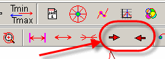
To scroll along the price chart, use these buttons:
It may take some time while you find the similar slices; sometimes you may find none. Or you go directly to the period that somebody claims as an analog to your analyzed piece of the price chart, - and you will see yourself.
For our example, finally I have found this pattern in May, 2006:
Make two mouse clicks to finalize your work (the third click is on the end of a similar price chart slice, and the fourth click is for vertical adjustment of the pattern; move the similar slice vertically a bit till a maximum fit with your original pattern):
Thus these two charts give you some clues regarding possible movement of S&P500 in March 2008 in respect to that analogy in May 2006:
As for any charting tool in Timing Solution, you can vary its parameters like the color of the price chart diagram and enabling/disabling the time scale.
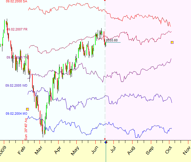
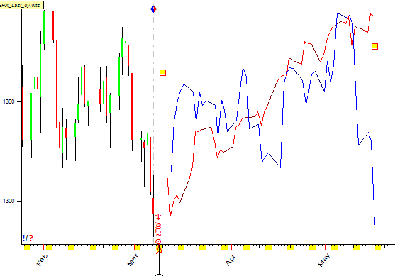
 Planetary adjusted price chart slice
On March 10, 2008 the Moon was passing the Zodiacal sign of Aries. You know how chaotic the stock market has been then. Let us try to find some regular pattern even at that crazy time. The technique described below helps to find some "anchor" in time, some track of history pattern repetition. You can treat it as the anchor to other dimension. It is the answer to the question what has happened to the stock market when the Moon passed the sign of Aries a month ago, two moths ago, etc. and how we can use that information.
With Timing Solution Advanced, it is very easy to do. Highlight "Planetary adjusted price chart slice" item and drag the mouse starting from March 10,2008 to several weeks ahead:
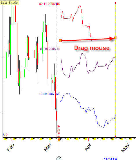
You will get three pieces of price charts; each of them starts at the moment when the Moon enters Aries:
the first one (the red graph) corresponds to February 11, 2008 - the closest to March 2008 day when the Moon passes Aries;
another one sends us to January 15, 2008;
and the last one (the blue chart) corresponds to December 19,2007.
Thus we can see three pieces of the same price chart that show us what has happened after the Moon entered Aries.
With this technique, you may find the planetary pattern that repeats itself. Pay attention to the zones where several charts point at the same direction. I highlighted the zone where two price charts show the upward movement:

Now look in the Options for this charting tool:
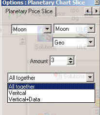
Here you can vary the amount of price slices to be displayed, the planetary combination and a kind of presentation of these charts.
You can display them in one box. For example, setting the Sun-Sun combination, I can easily display the recent Annual cycles:
![]() Astro based
charting tools
Astro based
charting tools
These charting tools are based on different principles than standard math applications; they use astronomy's rules. Some of them are just the continuation of ideas developed for previously discussed charting tools. The difference comes mostly from a special way of dealing with the Time.
 Equidistant lines
Let us start with non astronomical charting tool - "Equidistant
lines". This way you will easily understand how all astronomy based
charting tools are organized.
Dragging the mouse cursor from point A to point B (while "Equidistant
lines" tool is activated), you simply display a bunch of
vertical lines equidistant one to another (59.4 calendar days step is used in this example):
In other words, these lines are based on equal steps on the time scale. If you use BAR scale, the distance is calculated in bars (or in trade days for daily data):
For your convenience, you can set in parameters the color and thickness of these lines as you like; also you can order displaying additional lines (overtones):
 Planetary equidistant lines
Technically this charting tool is pretty close to "Equidistant lines" charting tool. The very important difference is that the TIME is measured here in degrees of the angle separation between two planets or in degrees of the planetary position of any single planet.
(We can measure the time using the atomic clocks, or using the Moon phases, or Venus phases. What time measurement is more appropriate? It depends on the task we deal with. If we analyze some physical, chemical, or other process - no doubt, the time measured by the ceasium-133 atoms oscillations is more suitable. However, for the processes where human activity is involved - like the stock market - I do not know how appropriate atomic clocks are.)
Thus, while with "Equidistant lines" charting tool we measure time in DAYS (calendar or trade days), with "Planetary equidistant lines" we measure time in planetary angles. Planetary angles play a role of TIME in this charting tool; see more about it here http://www.timingsolution.com/TS/Articles/PT/index.htm
The example below shows "Planetary equidistant lines" for Jupiter-Uranus heliocentric angle. Here the increment for the angle between these two planets (Jupiter and Uranus) in the chosen system of coordinates (heliocentric) is 4 degrees 30 minutes of arc:
The other name for this procedure is "stepping"
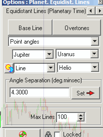
Technically it works this way. Clicking on "Planetary equidistant lines", you get this dialog box; set there the planetary combination (in our example, this is Jupiter-Uranus heliocentric angle separation):
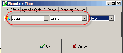
If you prefer to display the charting tool for the Sun position (or any single planet), change this setting to Sun-Sun (or some planet to the same planet).
Now drag the mouse cursor connecting two turning points:
Why this charting tool is so important? The answer is in non even planetary movements. This fact makes the astro based charting tools irregular, and this is very typical for the stock market behavior.
Here you can see regular equidistant lines (blue) together with Jupiter-Uranus helio equidistant lines (red):
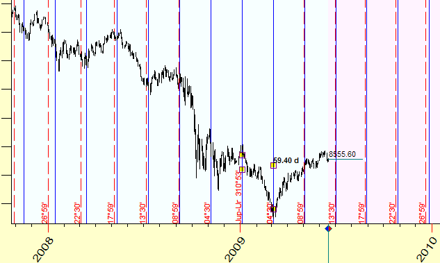
The difference between red and blue lines reaches two weeks within one year.
In Options window you can define the planetary combination, Zodiac, lines appearance - color and thickness.
In the example above, we chose only the planets and Zodiac. The step (degrees of the angle separation) was defined by the change of that angle between the two turning points. And then we have applied that step (found by the program) to create the charting tool. You can set the degree of angle separation manually as well. Suppose that you set the initial position to 300 degrees and step of angle separation to 17 degrees:
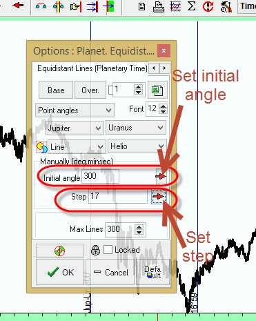
The program moves the second anchors to the new position that corresponds to initial angle between Jupiter and Uranus to 300 degrees and step to 17 degrees:
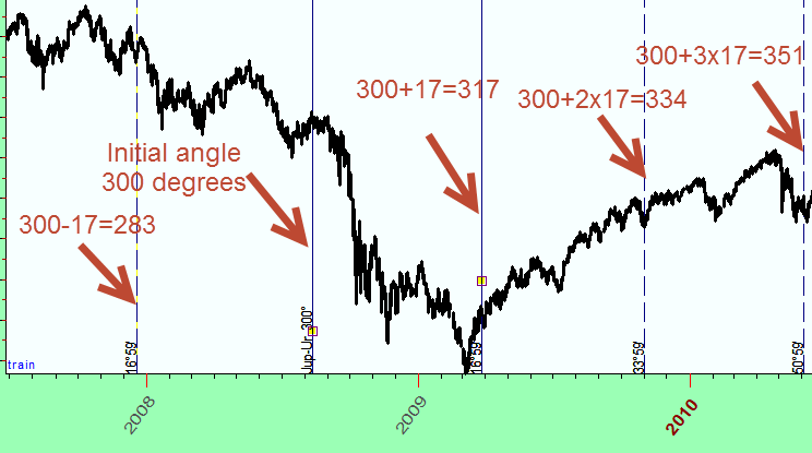
In other words, when you set the step manually, you actually define the planets and Zodiac (or the system of coordinates) and the step and choose some starting point. The program uses the value of the angle separation between your planets (300 degrees) and shows the lines that correspond to the angles: (300 + 17 degrees), (300 + 2*17),..., (300 - 17 degrees), (300 - 2*17), etc.
Here is one recommendation while using this tool. Try to draw "Planetary equidistant lines" connecting any two important turning points, then vary planetary combinations and Zodiac types in the Options:
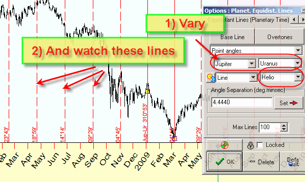
While doing that, watch how other lines hit other turning points. This is the way to look for the most informative planetary combination for your stock market data.
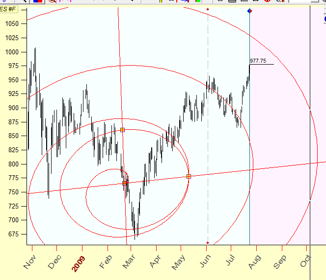
 Planetary returns (same cycle)
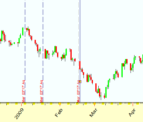
This charting tool is based on the idea of returns - the moments when some planet comes again to some position or when two planets make again the same angle between themselves. The actual job of calculation and comparison is done by the program, your actions are just to define your intentions and operate the mouse. While you drag the mouse cursor, the program calculates the Zodiacal position of the chosen planet or the angle between two planets and displays a bunch of vertical stripes that correspond to the moments when this planet reaches the same Zodiacal position (or when there is the same angle between two planets). Look at the example below. Here the mouse cursor is located in the middle of February, 2009. The Mercury position was 3 degrees 17 minutes. Two additional vertical lines indicate the moments when Mercury has passed the same Zodiacal position:
![]() Planetary returns
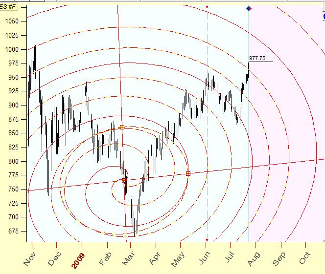
Planetary returns
This charting tool is very similar to the previous charting tool. The only difference is that this charting tool covers all synodic cycles, and therefore more vertical lines are shown .
![]() Planetary steps
Planetary steps
Again, this charting tool is similar to the tool discussed above, "Planetary equidistant lines". As for the previous tool, here you can set the angle increment manually. And you can use not only the same step, but different steps (like in Fibonacci sequence). In the example below the mouse cursor is set on the beginning of March 30, 2009, when Mercury was in the 10th degrees of Aries.
The steps 15, 72 and 90 degrees are used. So vertical lines here represent Mercury at 25 degrees of Aries (10 degrees Aries + 15 degrees), Mercury at 22 degrees of Gemini (10 degrees Aries + 72 degrees) and Mercury at 10 degrees of Cancer (10 degrees Aries + 90 degrees):
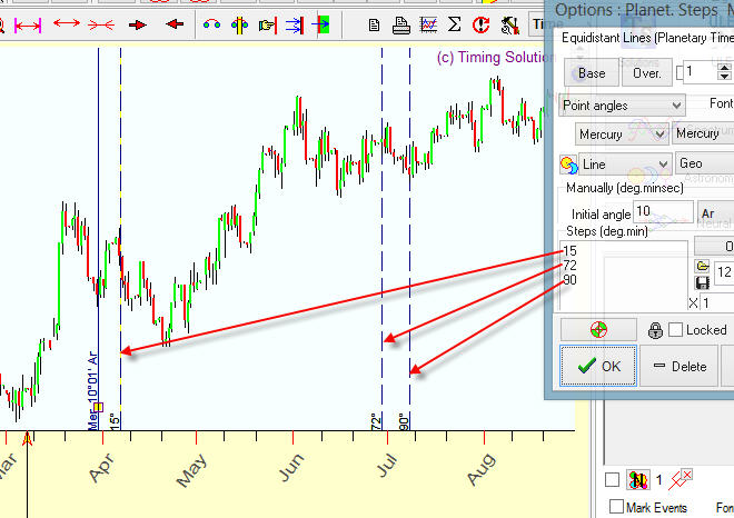
Coloring: You may set the color for each line this way:
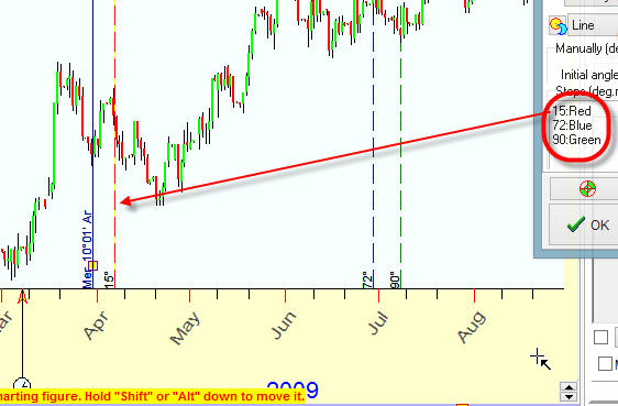
You can use these colors:
RED
BLUE
GREEN
LIME
BLACK
WHITE
GRAY
SILVER
YELLOW
AQUA
TEAL
OLIVE
MAROON
NAVY
FUCHSIA
ORANGE
PURPLE
Also you can apply shades of different colors using combinations like these ones: LIGHTRED, LIGHTLIGHTRED, DARKRED, DARKDARKRED
Grouping: you can easily draw the group of planetary lines. Suppose you would like to draw the bunch of planetary lines that represent 30, 60, 90, 120...360 degrees of increased Sun (or any other planet) position.
You can type all these steps one by one:
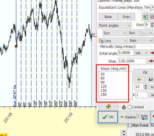
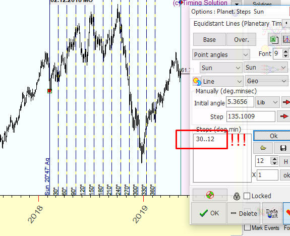
Or you can do the same thing by typing one line only: 30..12
It means that you would like to see the same 12 lines with the increment of 30 degrees each:
Calendar days steps: Another possibility is to use steps calculated in days (calendar days and trading days). As an example of using this feature, please look at the picture below where we display the lines positioned at 15 calendar days after March 30, as well as 72 days and 90 days:
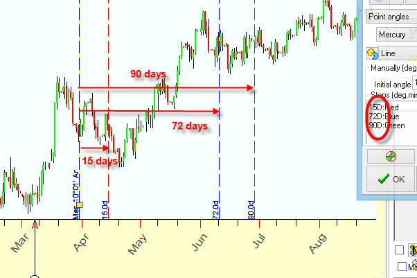
15D - means 15 days
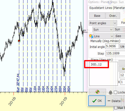
Look at another example. Here we display 12 lines with the increment of 30 calendar days each, i.e. 30 days, 60 days, 90 days, 120 days ... you can type this line as 30D..12
Trading days steps: Another possibility is to calculate a distance in bars (trading days for EOD chart), this is how to do that:

15B - means 15 bars
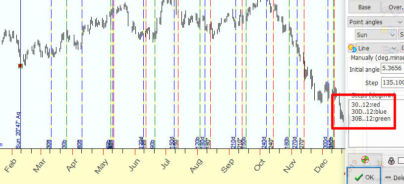
As an example, we draw together three bunches of lines: red - 12 lines with 30 degrees increment of the Sun position (30..12:red), blue - 12 lines with the increment of 30 calendar days (30D..12) and green - 12 lines with the increment of 30 calendar days (30B..12):
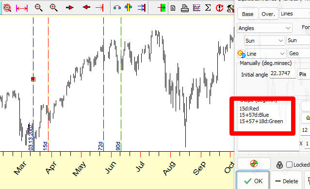
Usage formulas: pay attention, you can use formulas for step. For example 15,72,9 days pattern can be expressed this way as a distance between steps 15 days, 15+57 days, 15+57+18 days:
You can prolong this 90 days pattern in future further:
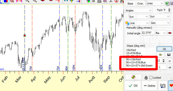
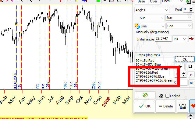
Next step:
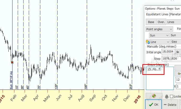
Fibonacci sequence Grouping: you can easily draw the group of planetary lines bases on Fibonacci numbers.
The Fibonacci numbers looks this way: 1,2,3,5,8,13,21,34... We can use these numbers as multiplier for our steps. Suppose you need to build Fibonacci steps with initial step=15 degrees of Sun movement.
It will be these steps 15,30,45,75,120,195... degrees of Sun movement. You can build these steps typing this:
15..Fib..7
The first parameter here is initial step, after that "Fib", and the last parameter 7 is amount of Fibonacci based lines:
Fibonacci square root sequence Grouping: the same manner you can build lines based on square root of Fibonacci numbers: 1, 1.41, 1.73, 2.24...
Type this
15..FibRoot..10
and you will get steps 15, 15*1.41=21.15, 15*1.73=29.95 ... degrees of Sun movement.
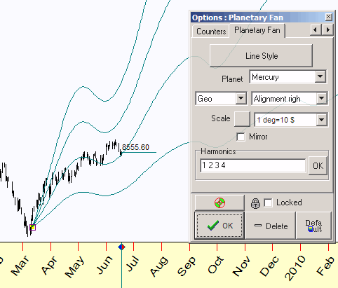
![]() Planetary fan
Planetary fan
This tool allows to display the bunch of planetary lines starting from point indicated by the mouse cursor. Here you can see the planetary lines for Mercury, the 1H, 2H, 3H, and 4H harmonics are used:
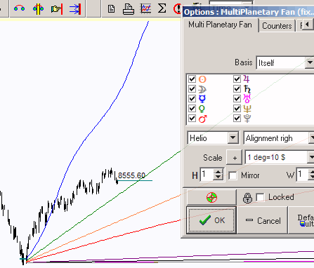
![]() Multi Planetary fan (fixed scale)
Multi Planetary fan (fixed scale)
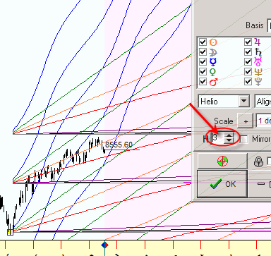
You can display the bunch of planetary lines for many planets at the same time. Here you can see the planetary lines for major planets:
When you use more harmonics, these lines look this way:
![]() Multi Planetary fan (free scale)
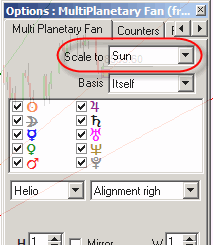
Multi Planetary fan (free scale)
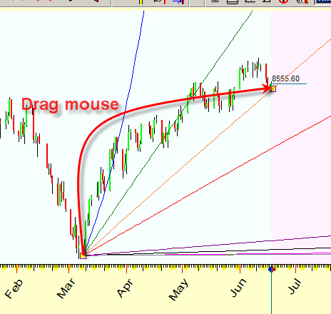
This charting tools works very similar to the previous charting tool, though there is one important difference. You do not need to set the scale parameter for planetary lines, the program finds its automatically while you drag the mouse cursor. In example below the mouse cursor moved between two points of the price chart; the Sun's planetary line hits both points. The planetary lines for other planets are displayed using the same scale as the scale for the Sun:
In options you define the planet to be used for Scaling:
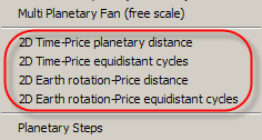 Two Dimensional distance charting tools
You might hear sometimes phrases like this: "analyze price and time together", "price time chart". All these phrases mean that we analyze price and time as a whole Universe. Not analyzing separately price and separately time. Together, they form a kind of Universe, like South-North and East-West are not separate geographic entities - but they describe one and the same entity - the Earth's surface. Exactly the same approach can be applied to price-time Universe. These two charting tools represent our vision of on this problem. This set of tools combines regular and astro based tools are the advanced version of the tools discussed above.
See here for more details: http://www.timingsolution.com/TS/Articles/ptd/
Remember that this is an experimental technology. We do not provide any recommendations here yet as we need some time to understand how this approach really works. We will be able to do that after getting enough response and feedback from users of these tools. However, even now this set of tools may provide some ideas how price-time landscape looks like.
The first thing we should to is to define the distance between two points on this price-time landscape. Here you can see the example - the distances between turning points A, B, C and D; they form the angles close to harmonics:
distance A-B=356.47 degrees, close to the whole cycle;
distance B-C =89.22 degrees, close to a quarter of the whole cycle;
distance C-D =46.13 degrees, close to the eighth part of the whole cycle.
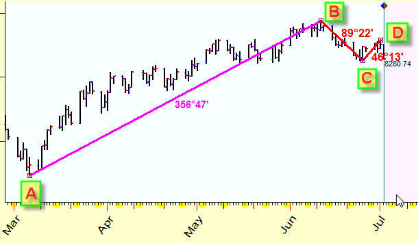
Thus we can draw equidistant cycles on the price - time landscape. It is possible (once again this is an experimental technique) that these cycles form a kind of attraction zones, like this:
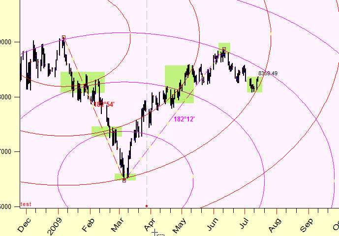
Depending on the planetary combination used to calculate the geographic map for this price-time Universe, it may look like this:
This "Terra Incognita" needs to be explored more.
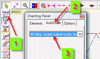
45 degrees scale
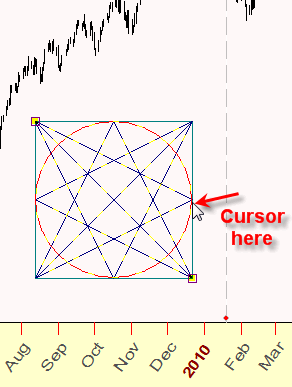
Suppose you need to draw the ideal Gann Square, i.e. Gann Square that has exact equal length and height on your monitor.
In order to do that, choose this option in "Charting Panel" window => "AutoScale" tab =>"45 deg scale" item:
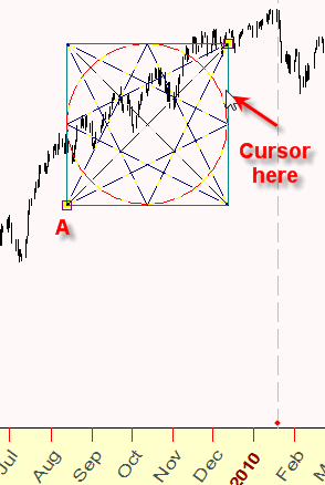
Now you simply drag the mouse cursor from the point A to the point B defining the length of Gann Square. While you move the mouse cursor, the program sets the position of the anchor C automatically to complete the ideal box (length equal height):
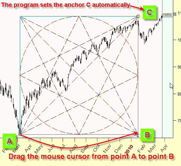
Pay attention: if the mouse cursor is located higher than the anchor A, the program draws a "positive" square:
if the mouse cursor is lower than the anchor A - it draws a "negative" square:
Manually defined scale
Another example: you need to draw Gann Square with the scale: 7 calendar days correspond to $100. In this case choose "Manually defined" scale there, type scale and do not forget to click OK button. After that you are able to draw Gann Square the same way as in the previous example; the program sets the vertical size of Gann Square automatically according to your scale:
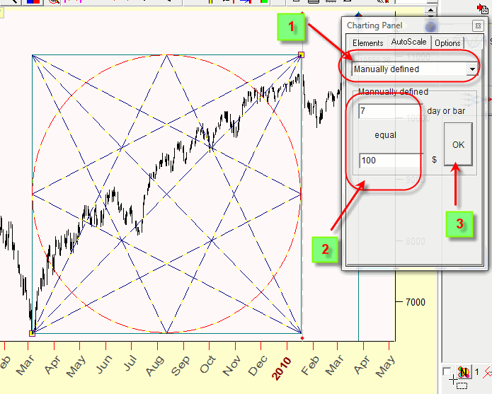
Pay attention what kind of metric - Time or Bar - is set in the Main screen. If Time metric is chosen:
the program uses CALENDAR days. Otherwise choosing BAR metric you get Gann Square with 7 trading days equal to $100. This is especially important if you work with intraday data, for intraday this scale corresponds 7 bars=$100 (though this particular scale is too high for intraday; it may be for Brazil Bovespa).
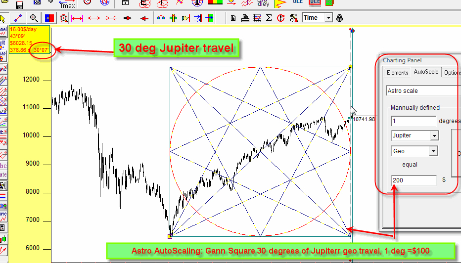
Astro scale
This is the most interesting scale. Suppose you need to draw astro based Gann Square.
To calculate the length of our square we use traveling path of some planet. Suppose it will be the Sun's traveling path of 100 degrees; we define the vertical size of our square as 1 degree = $15.
In order to draw this charting tool, choose "Astro scale" item, define the scale there and do not forget to click OK button.
Now you can draw the Gann Square in a regular way. The program calculates the height of our square automatically while you draw it:
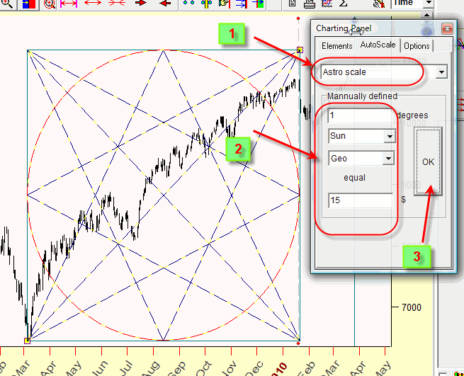
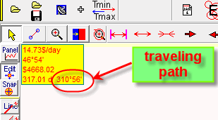
Remember: while you move the mouse cursor, the program points at the traveling path for the chosen planet in the left top part of the Main screen:
Example
With these different types of scale, you can easily solve the tasks like this one described below.
Let us draw Gann Square charting tool with these features:
- it starts March 6, 2009 (Great bottom);
- it covers the time interval that corresponds to 30 degrees of Jupiter's geo path;
- the price scale is 1 deg Jupiter travel = $200
We do it this way:
- set Astro AutoScale as it is shown on this picture (it is in the right corner);
- drag the mouse starting from March 6, 2009 and watch the increments of Jupiter travel path as in this picture (left top corner), drag it till 30 degrees
This is our Gann Square:
Sergey Tarassov.
Ontario lakes - Georgian Bay - Toronto, Canada
August, 2009
March, 2010
Appendix: RGB color table from website: http://www.rapidtables.com/web/color/RGB_Color.htm
Basic colors:
| Color | HTML / CSS Name | Hex Code #RRGGBB |
Decimal Code (R,G,B) |
|---|---|---|---|
| Black | #000000 | (0,0,0) | |
| White | #FFFFFF | (255,255,255) | |
| Red | #FF0000 | (255,0,0) | |
| Lime | #00FF00 | (0,255,0) | |
| Blue | #0000FF | (0,0,255) | |
| Yellow | #FFFF00 | (255,255,0) | |
| Cyan / Aqua | #00FFFF | (0,255,255) | |
| Magenta / Fuchsia | #FF00FF | (255,0,255) | |
| Silver | #C0C0C0 | (192,192,192) | |
| Gray | #808080 | (128,128,128) | |
| Maroon | #800000 | (128,0,0) | |
| Olive | #808000 | (128,128,0) | |
| Green | #008000 | (0,128,0) | |
| Purple | #800080 | (128,0,128) | |
| Teal | #008080 | (0,128,128) | |
| Navy | #000080 | (0,0,128) |
| Color | Color Name | Hex Code #RRGGBB |
Decimal Code R,G,B |
|---|---|---|---|
| maroon | #800000 | (128,0,0) | |
| dark red | #8B0000 | (139,0,0) | |
| brown | #A52A2A | (165,42,42) | |
| firebrick | #B22222 | (178,34,34) | |
| crimson | #DC143C | (220,20,60) | |
| red | #FF0000 | (255,0,0) | |
| tomato | #FF6347 | (255,99,71) | |
| coral | #FF7F50 | (255,127,80) | |
| indian red | #CD5C5C | (205,92,92) | |
| light coral | #F08080 | (240,128,128) | |
| dark salmon | #E9967A | (233,150,122) | |
| salmon | #FA8072 | (250,128,114) | |
| light salmon | #FFA07A | (255,160,122) | |
| orange red | #FF4500 | (255,69,0) | |
| dark orange | #FF8C00 | (255,140,0) | |
| orange | #FFA500 | (255,165,0) | |
| gold | #FFD700 | (255,215,0) | |
| dark golden rod | #B8860B | (184,134,11) | |
| golden rod | #DAA520 | (218,165,32) | |
| pale golden rod | #EEE8AA | (238,232,170) | |
| dark khaki | #BDB76B | (189,183,107) | |
| khaki | #F0E68C | (240,230,140) | |
| olive | #808000 | (128,128,0) | |
| yellow | #FFFF00 | (255,255,0) | |
| yellow green | #9ACD32 | (154,205,50) | |
| dark olive green | #556B2F | (85,107,47) | |
| olive drab | #6B8E23 | (107,142,35) | |
| lawn green | #7CFC00 | (124,252,0) | |
| chart reuse | #7FFF00 | (127,255,0) | |
| green yellow | #ADFF2F | (173,255,47) | |
| dark green | #006400 | (0,100,0) | |
| green | #008000 | (0,128,0) | |
| forest green | #228B22 | (34,139,34) | |
| lime | #00FF00 | (0,255,0) | |
| lime green | #32CD32 | (50,205,50) | |
| light green | #90EE90 | (144,238,144) | |
| pale green | #98FB98 | (152,251,152) | |
| dark sea green | #8FBC8F | (143,188,143) | |
| medium spring green | #00FA9A | (0,250,154) | |
| spring green | #00FF7F | (0,255,127) | |
| sea green | #2E8B57 | (46,139,87) | |
| medium aqua marine | #66CDAA | (102,205,170) | |
| medium sea green | #3CB371 | (60,179,113) | |
| light sea green | #20B2AA | (32,178,170) | |
| dark slate gray | #2F4F4F | (47,79,79) | |
| teal | #008080 | (0,128,128) | |
| dark cyan | #008B8B | (0,139,139) | |
| aqua | #00FFFF | (0,255,255) | |
| cyan | #00FFFF | (0,255,255) | |
| light cyan | #E0FFFF | (224,255,255) | |
| dark turquoise | #00CED1 | (0,206,209) | |
| turquoise | #40E0D0 | (64,224,208) | |
| medium turquoise | #48D1CC | (72,209,204) | |
| pale turquoise | #AFEEEE | (175,238,238) | |
| aqua marine | #7FFFD4 | (127,255,212) | |
| powder blue | #B0E0E6 | (176,224,230) | |
| cadet blue | #5F9EA0 | (95,158,160) | |
| steel blue | #4682B4 | (70,130,180) | |
| corn flower blue | #6495ED | (100,149,237) | |
| deep sky blue | #00BFFF | (0,191,255) | |
| dodger blue | #1E90FF | (30,144,255) | |
| light blue | #ADD8E6 | (173,216,230) | |
| sky blue | #87CEEB | (135,206,235) | |
| light sky blue | #87CEFA | (135,206,250) | |
| midnight blue | #191970 | (25,25,112) | |
| navy | #000080 | (0,0,128) | |
| dark blue | #00008B | (0,0,139) | |
| medium blue | #0000CD | (0,0,205) | |
| blue | #0000FF | (0,0,255) | |
| royal blue | #4169E1 | (65,105,225) | |
| blue violet | #8A2BE2 | (138,43,226) | |
| indigo | #4B0082 | (75,0,130) | |
| dark slate blue | #483D8B | (72,61,139) | |
| slate blue | #6A5ACD | (106,90,205) | |
| medium slate blue | #7B68EE | (123,104,238) | |
| medium purple | #9370DB | (147,112,219) | |
| dark magenta | #8B008B | (139,0,139) | |
| dark violet | #9400D3 | (148,0,211) | |
| dark orchid | #9932CC | (153,50,204) | |
| medium orchid | #BA55D3 | (186,85,211) | |
| purple | #800080 | (128,0,128) | |
| thistle | #D8BFD8 | (216,191,216) | |
| plum | #DDA0DD | (221,160,221) | |
| violet | #EE82EE | (238,130,238) | |
| magenta / fuchsia | #FF00FF | (255,0,255) | |
| orchid | #DA70D6 | (218,112,214) | |
| medium violet red | #C71585 | (199,21,133) | |
| pale violet red | #DB7093 | (219,112,147) | |
| deep pink | #FF1493 | (255,20,147) | |
| hot pink | #FF69B4 | (255,105,180) | |
| light pink | #FFB6C1 | (255,182,193) | |
| pink | #FFC0CB | (255,192,203) | |
| antique white | #FAEBD7 | (250,235,215) | |
| beige | #F5F5DC | (245,245,220) | |
| bisque | #FFE4C4 | (255,228,196) | |
| blanched almond | #FFEBCD | (255,235,205) | |
| wheat | #F5DEB3 | (245,222,179) | |
| corn silk | #FFF8DC | (255,248,220) | |
| lemon chiffon | #FFFACD | (255,250,205) | |
| light golden rod yellow | #FAFAD2 | (250,250,210) | |
| light yellow | #FFFFE0 | (255,255,224) | |
| saddle brown | #8B4513 | (139,69,19) | |
| sienna | #A0522D | (160,82,45) | |
| chocolate | #D2691E | (210,105,30) | |
| peru | #CD853F | (205,133,63) | |
| sandy brown | #F4A460 | (244,164,96) | |
| burly wood | #DEB887 | (222,184,135) | |
| tan | #D2B48C | (210,180,140) | |
| rosy brown | #BC8F8F | (188,143,143) | |
| moccasin | #FFE4B5 | (255,228,181) | |
| navajo white | #FFDEAD | (255,222,173) | |
| peach puff | #FFDAB9 | (255,218,185) | |
| misty rose | #FFE4E1 | (255,228,225) | |
| lavender blush | #FFF0F5 | (255,240,245) | |
| linen | #FAF0E6 | (250,240,230) | |
| old lace | #FDF5E6 | (253,245,230) | |
| papaya whip | #FFEFD5 | (255,239,213) | |
| sea shell | #FFF5EE | (255,245,238) | |
| mint cream | #F5FFFA | (245,255,250) | |
| slate gray | #708090 | (112,128,144) | |
| light slate gray | #778899 | (119,136,153) | |
| light steel blue | #B0C4DE | (176,196,222) | |
| lavender | #E6E6FA | (230,230,250) | |
| floral white | #FFFAF0 | (255,250,240) | |
| alice blue | #F0F8FF | (240,248,255) | |
| ghost white | #F8F8FF | (248,248,255) | |
| honeydew | #F0FFF0 | (240,255,240) | |
| ivory | #FFFFF0 | (255,255,240) | |
| azure | #F0FFFF | (240,255,255) | |
| snow | #FFFAFA | (255,250,250) | |
| black | #000000 | (0,0,0) | |
| dim gray / dim grey | #696969 | (105,105,105) | |
| gray / grey | #808080 | (128,128,128) | |
| dark gray / dark grey | #A9A9A9 | (169,169,169) | |
| silver | #C0C0C0 | (192,192,192) | |
| light gray / light grey | #D3D3D3 | (211,211,211) | |
| gainsboro | #DCDCDC | (220,220,220) | |
| white smoke | #F5F5F5 | (245,245,245) | |
| white | #FFFFFF | (255,255,255) |